UI/UX Design
.avif)
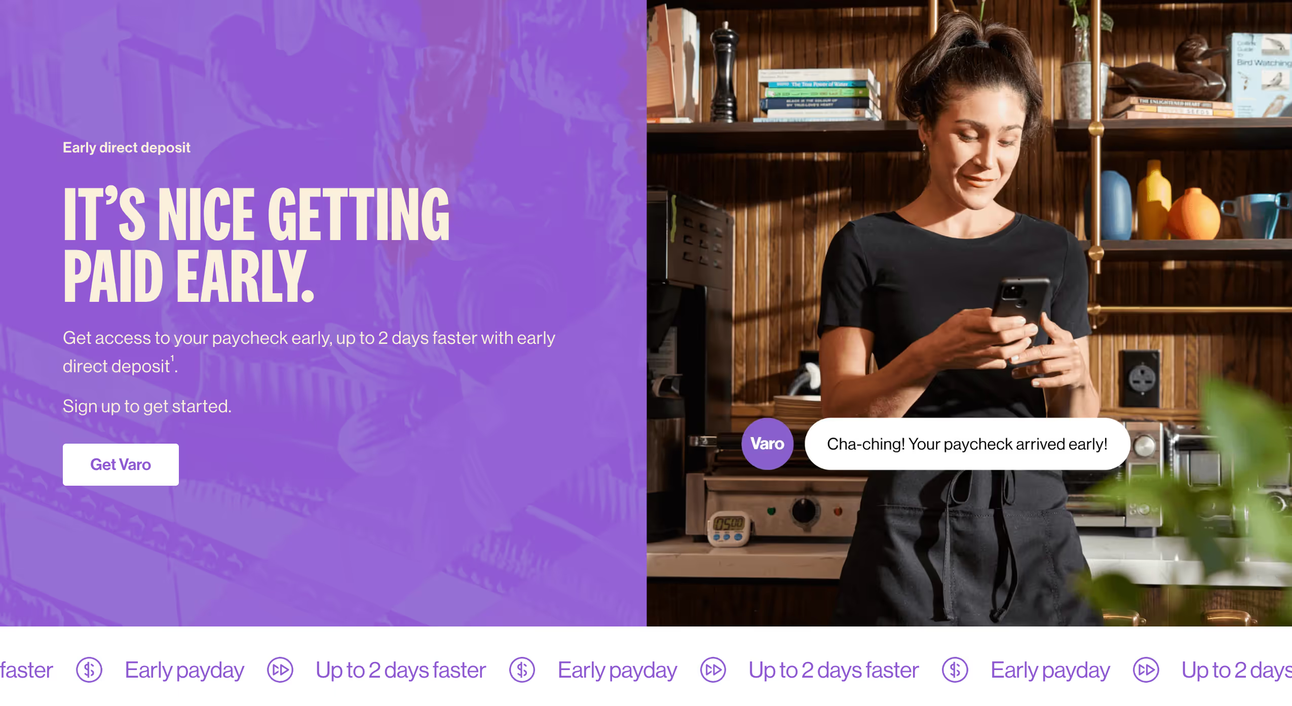
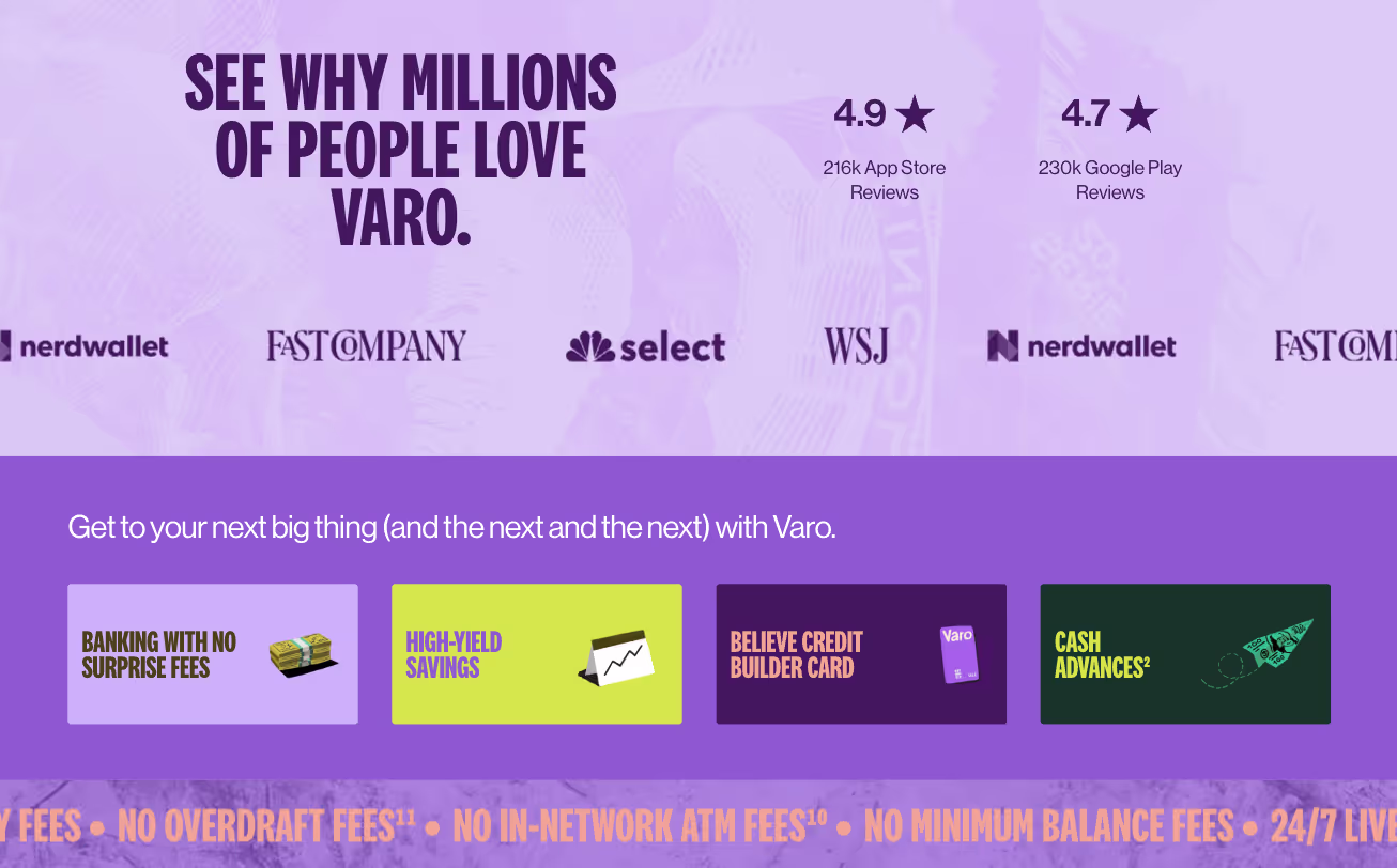
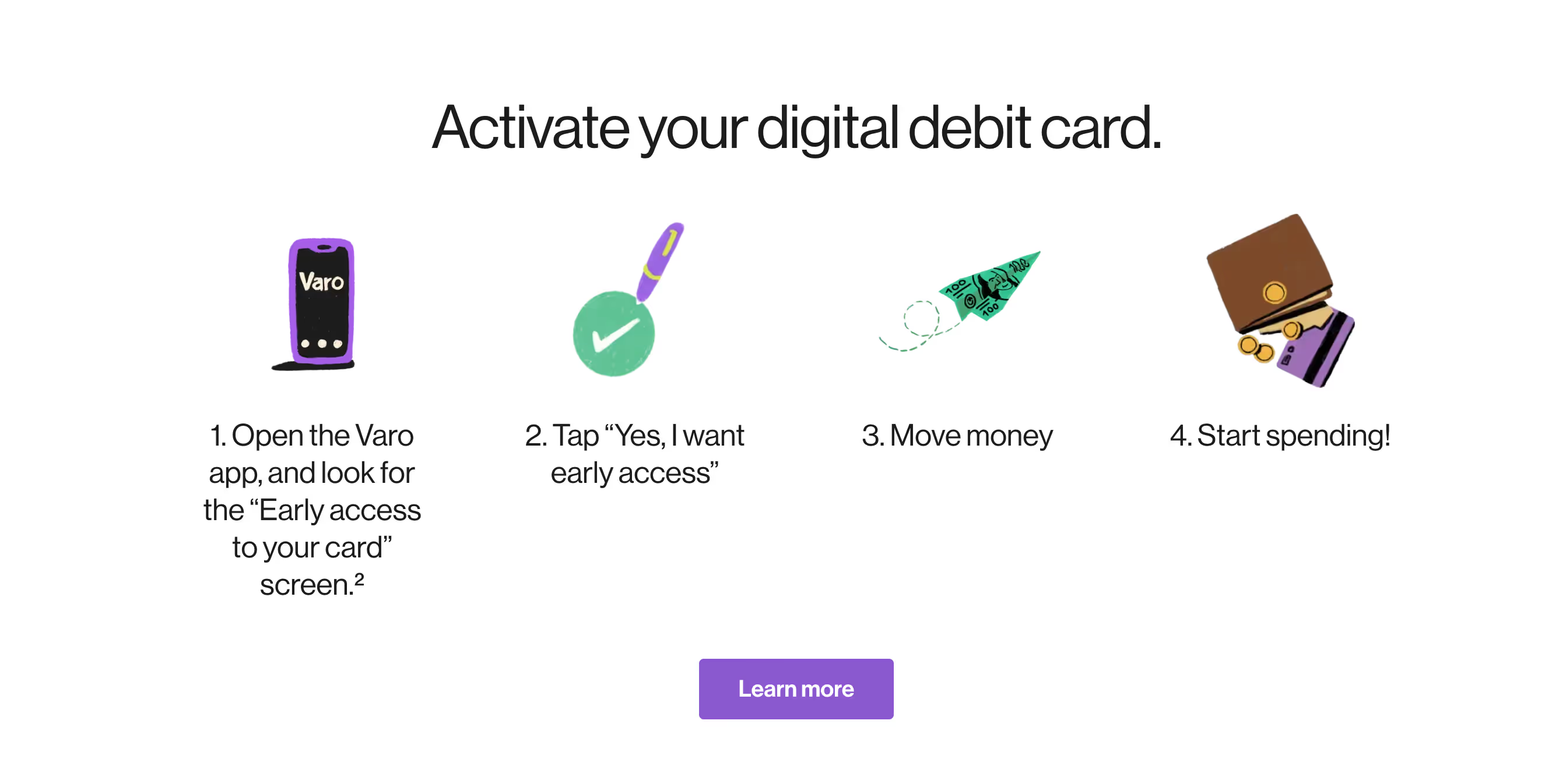
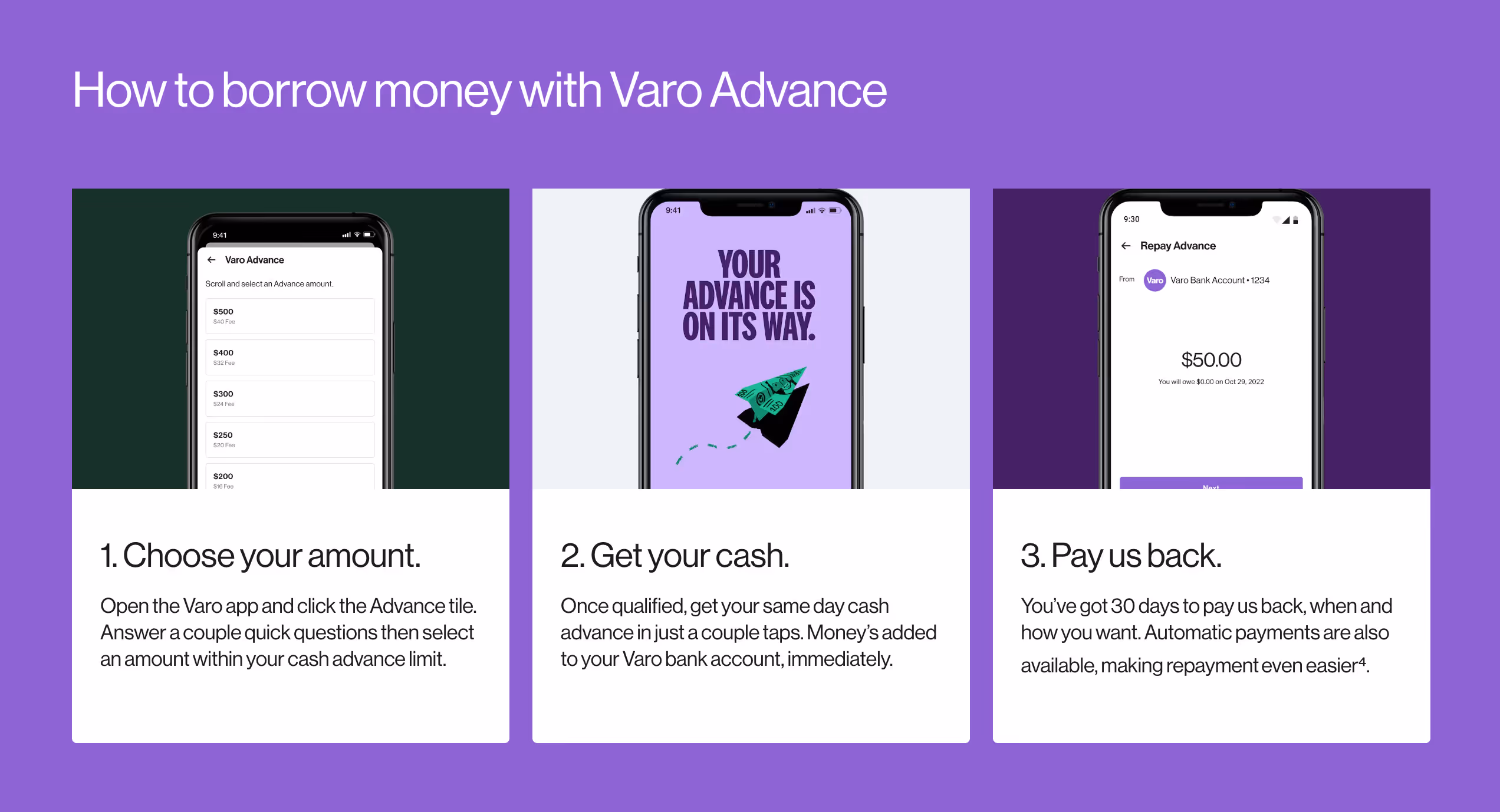
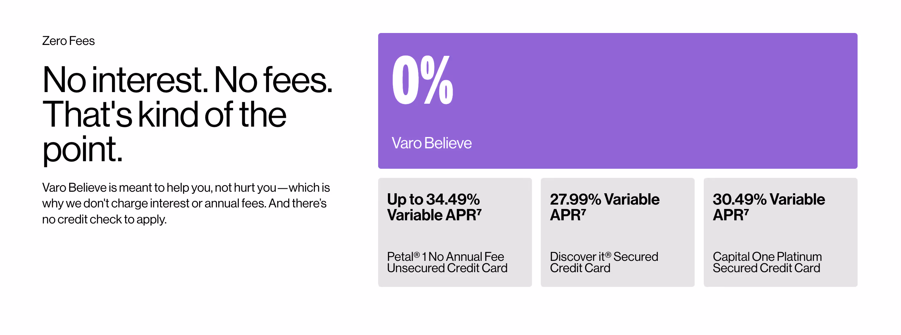
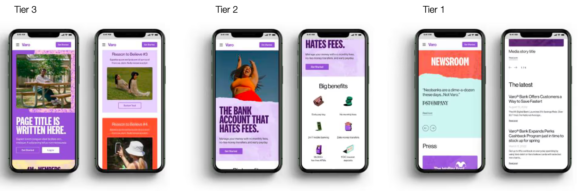
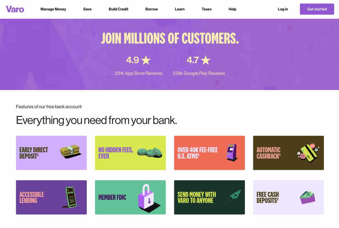
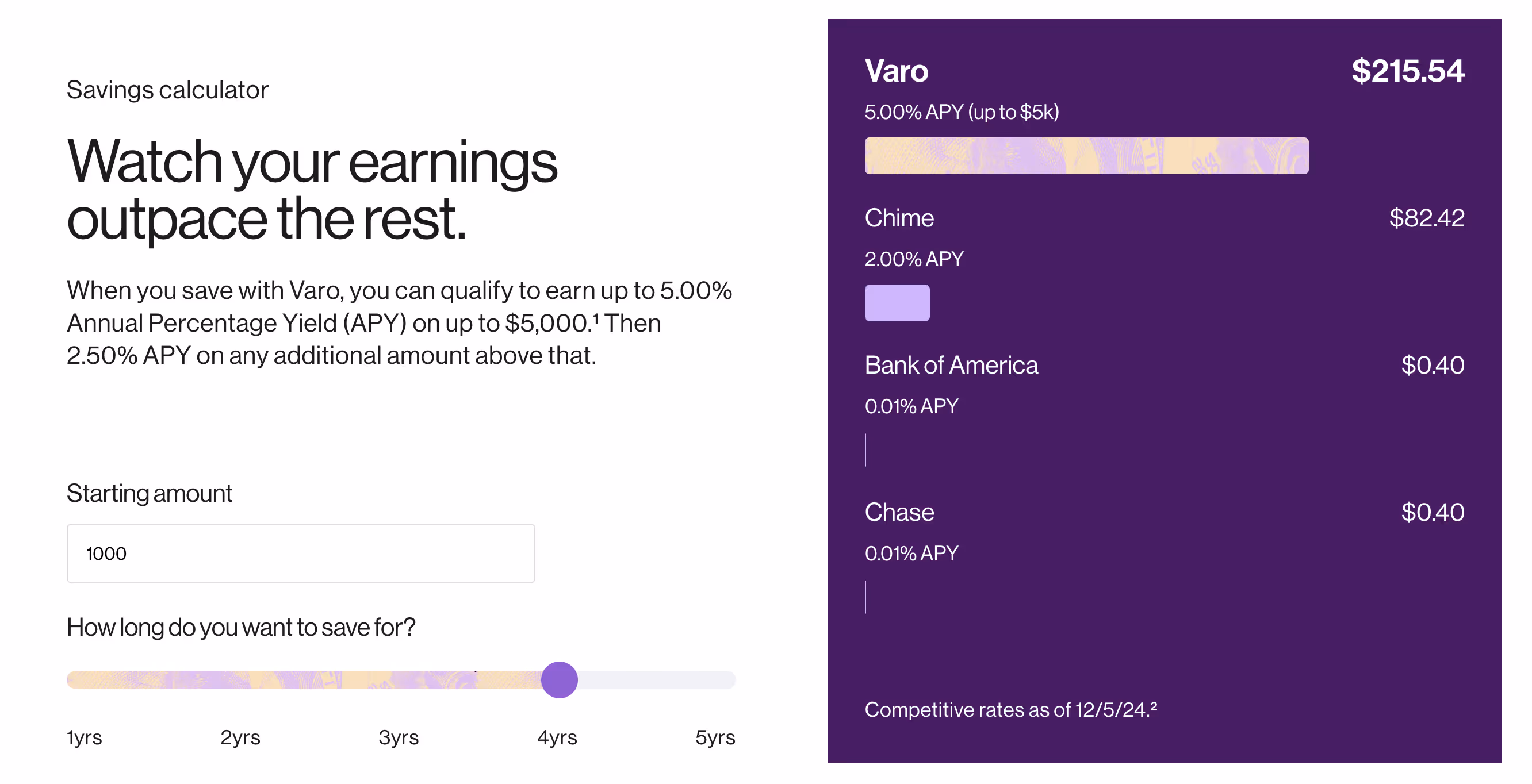
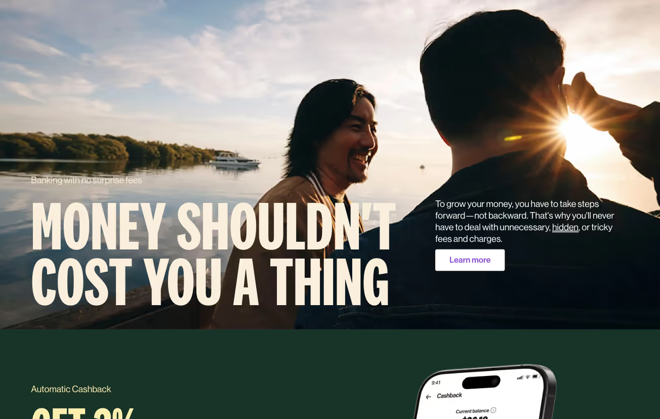
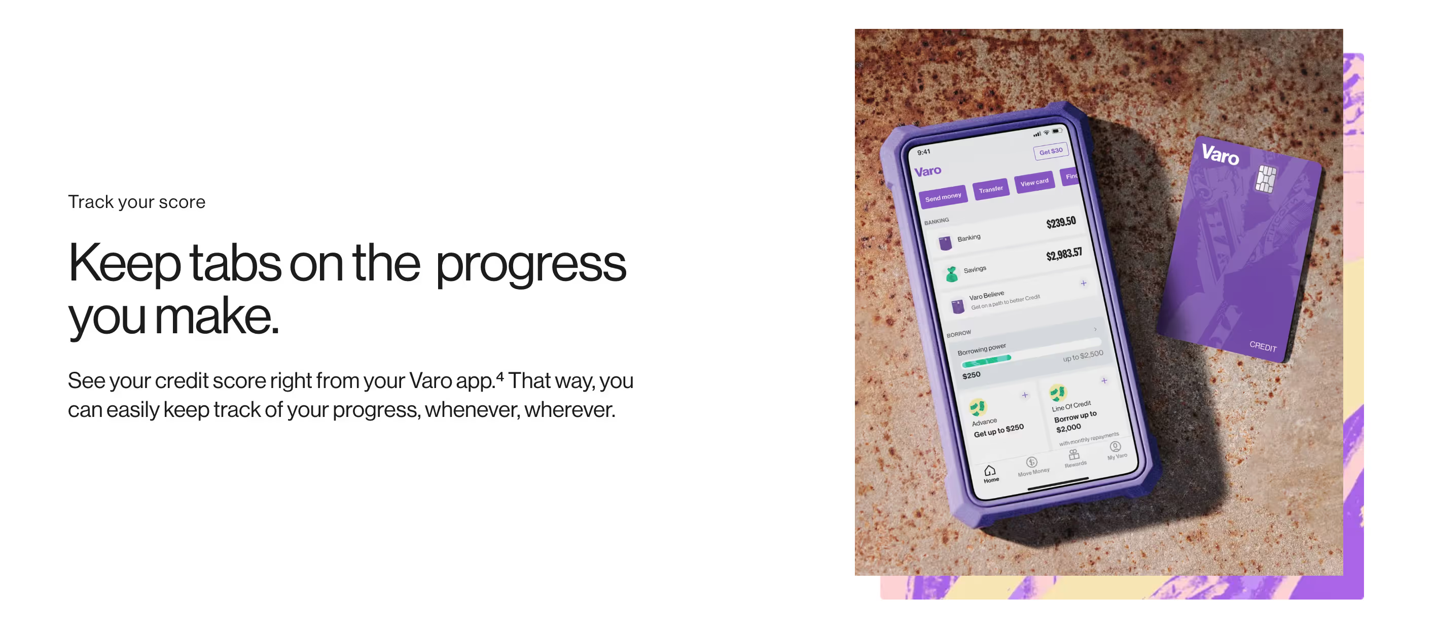
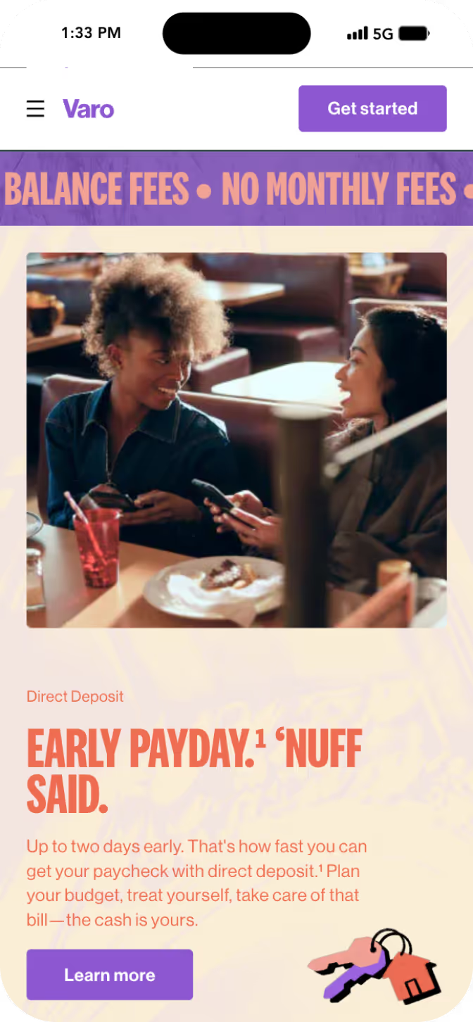
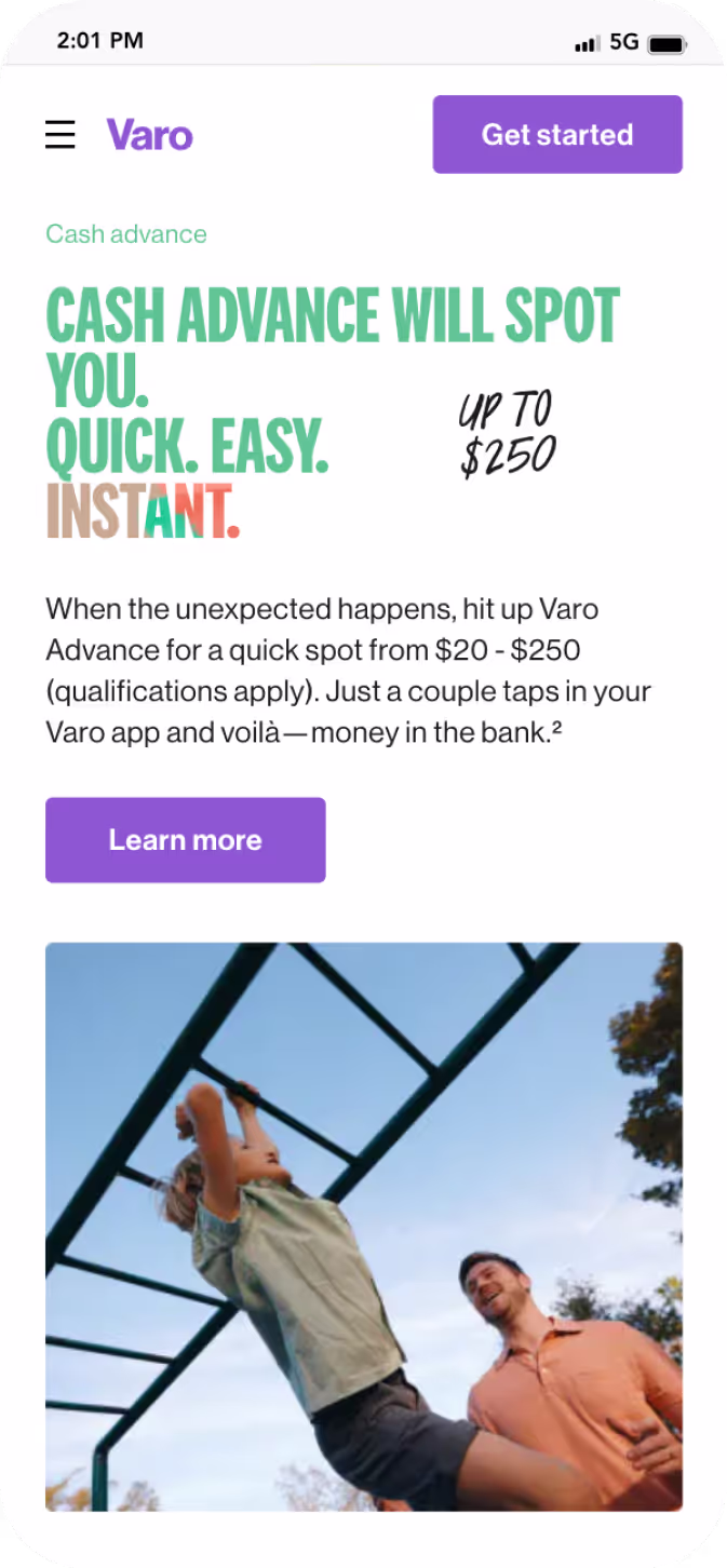
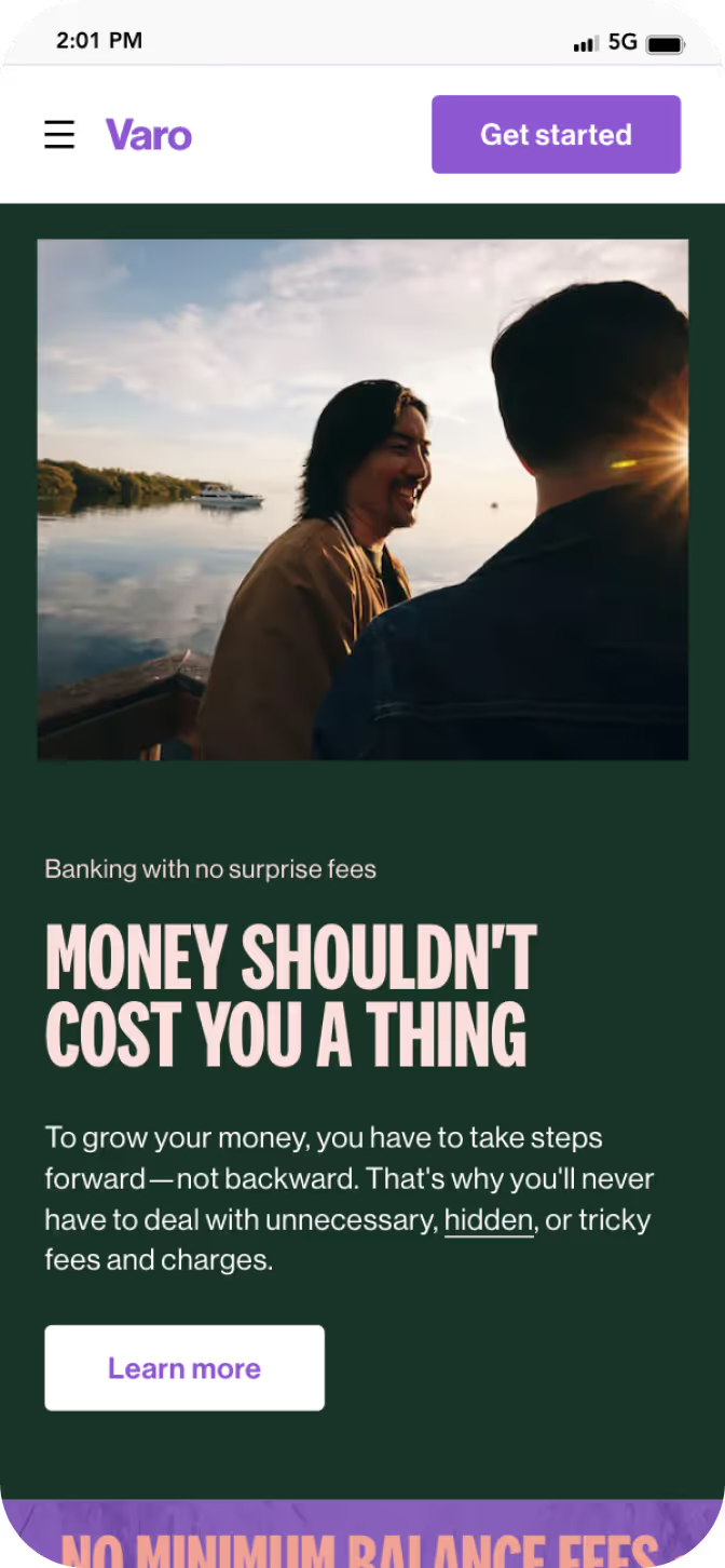
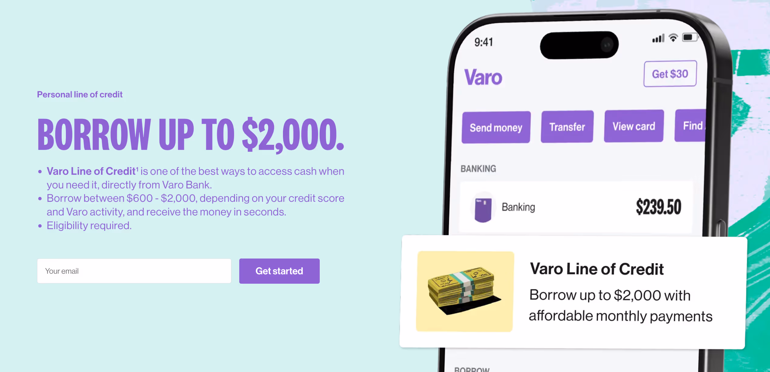
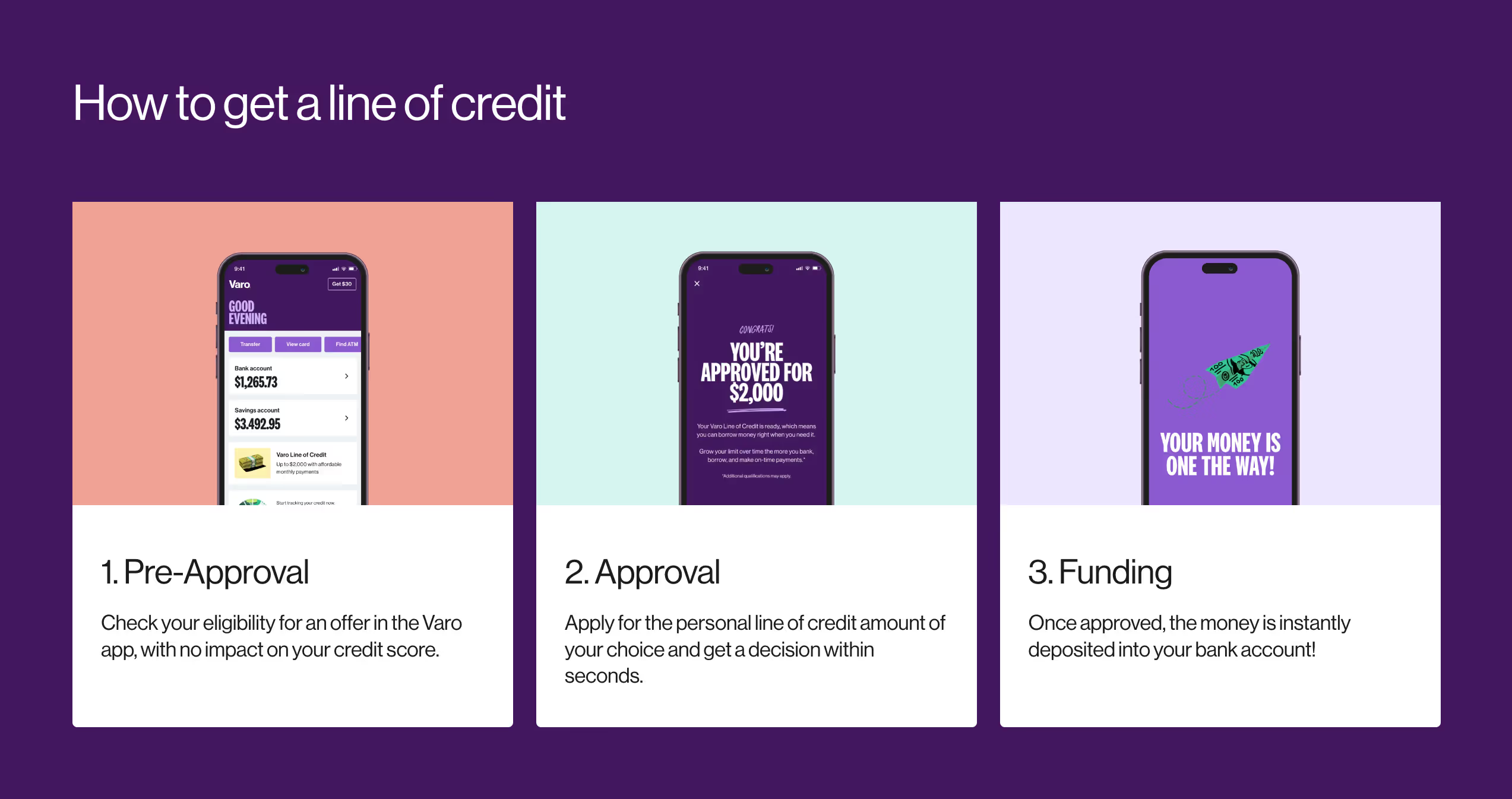
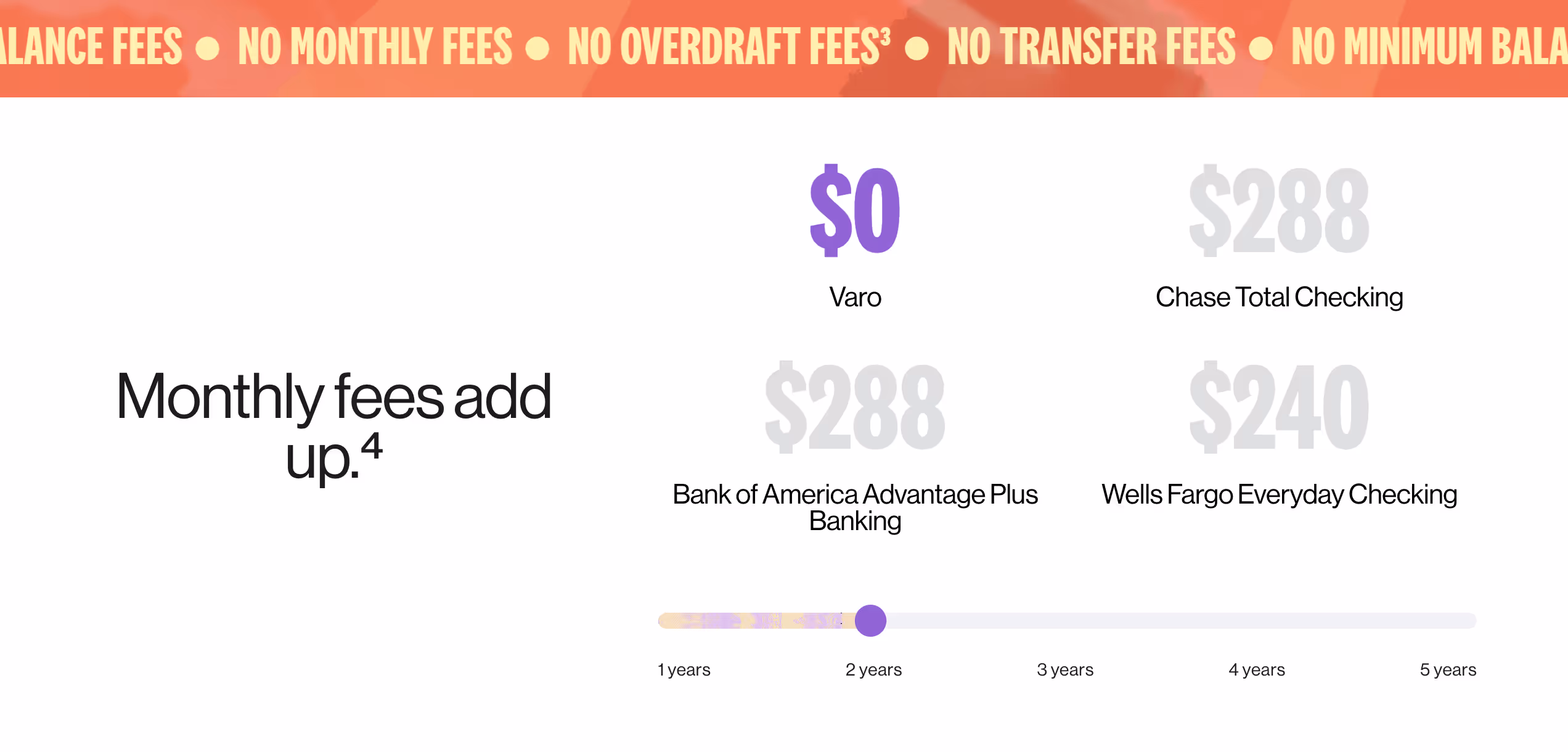
Challenge
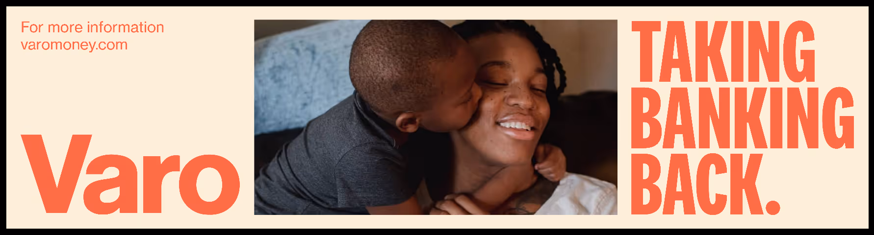
Redefining Varo's visual language to reflect its mission of financial inclusion while standing out in the crowded fintech space.
Solution
To create specific levels of brand expresion that effectively communicates and resonates with diverse audiences historically underserved by traditional banks
.
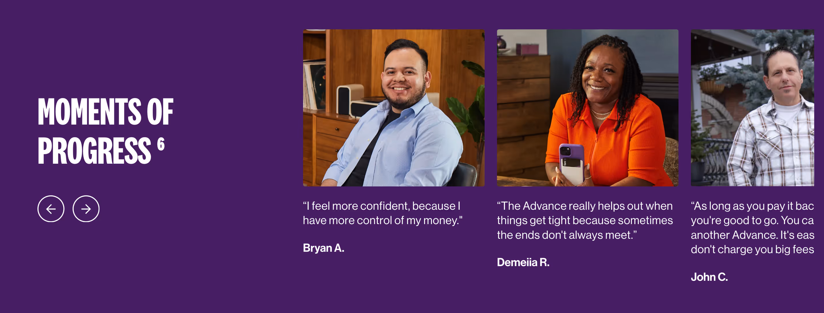
Outcome
- 68% Improvement in platform navigation and overall ease of use.
- 80% improved user feedback on improved personalized learning paths
- 61% increase in user engagement and platform interaction


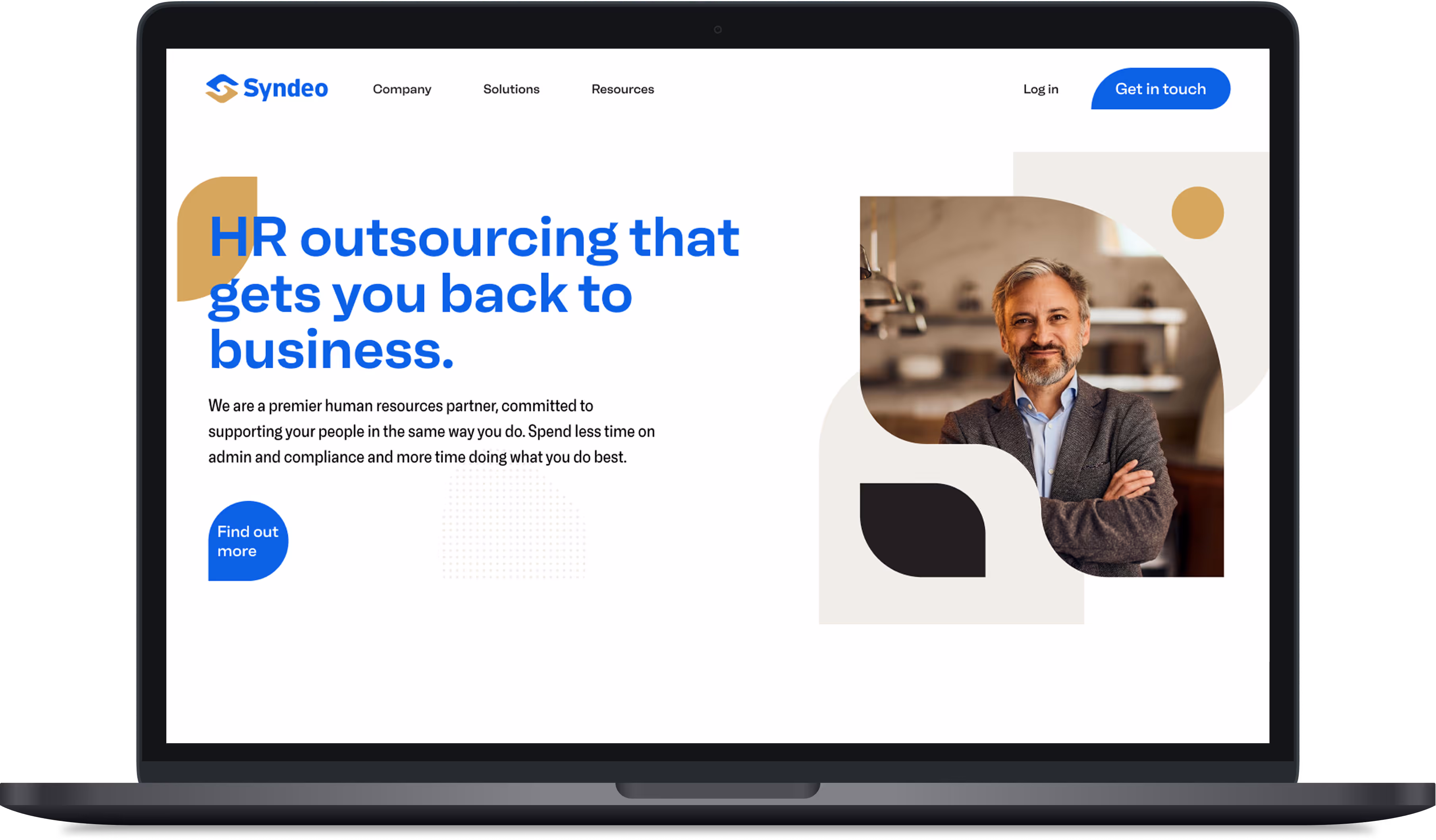
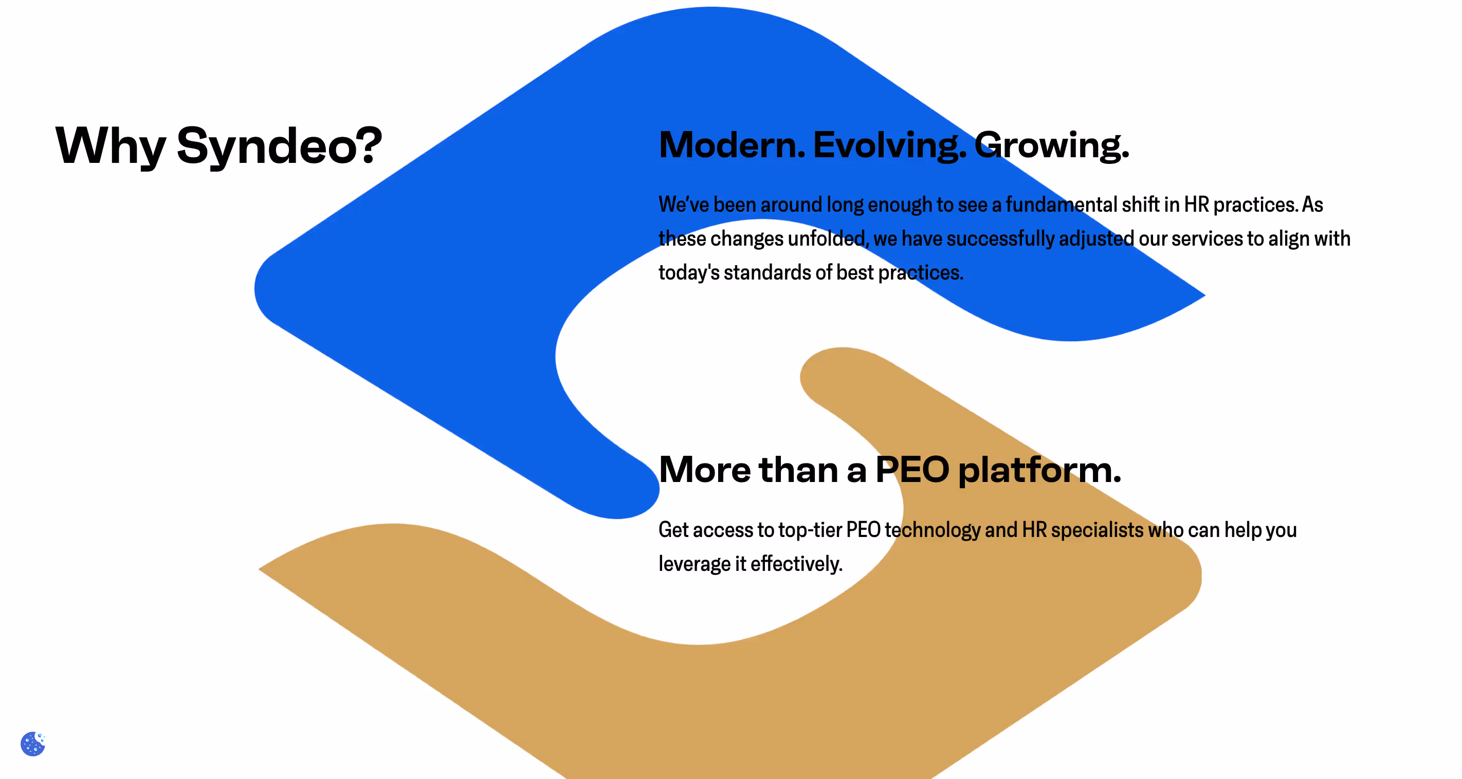
Challenge
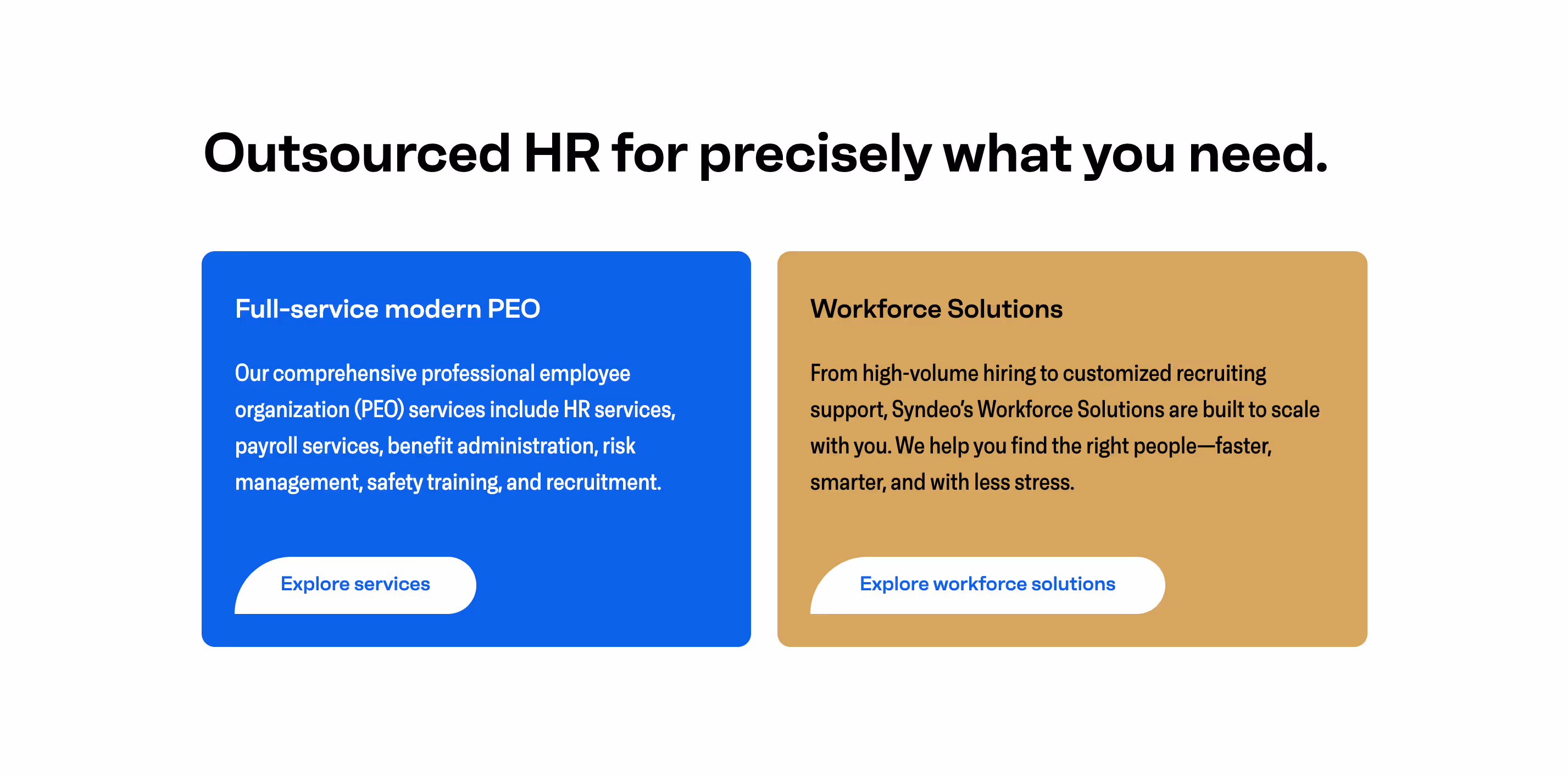
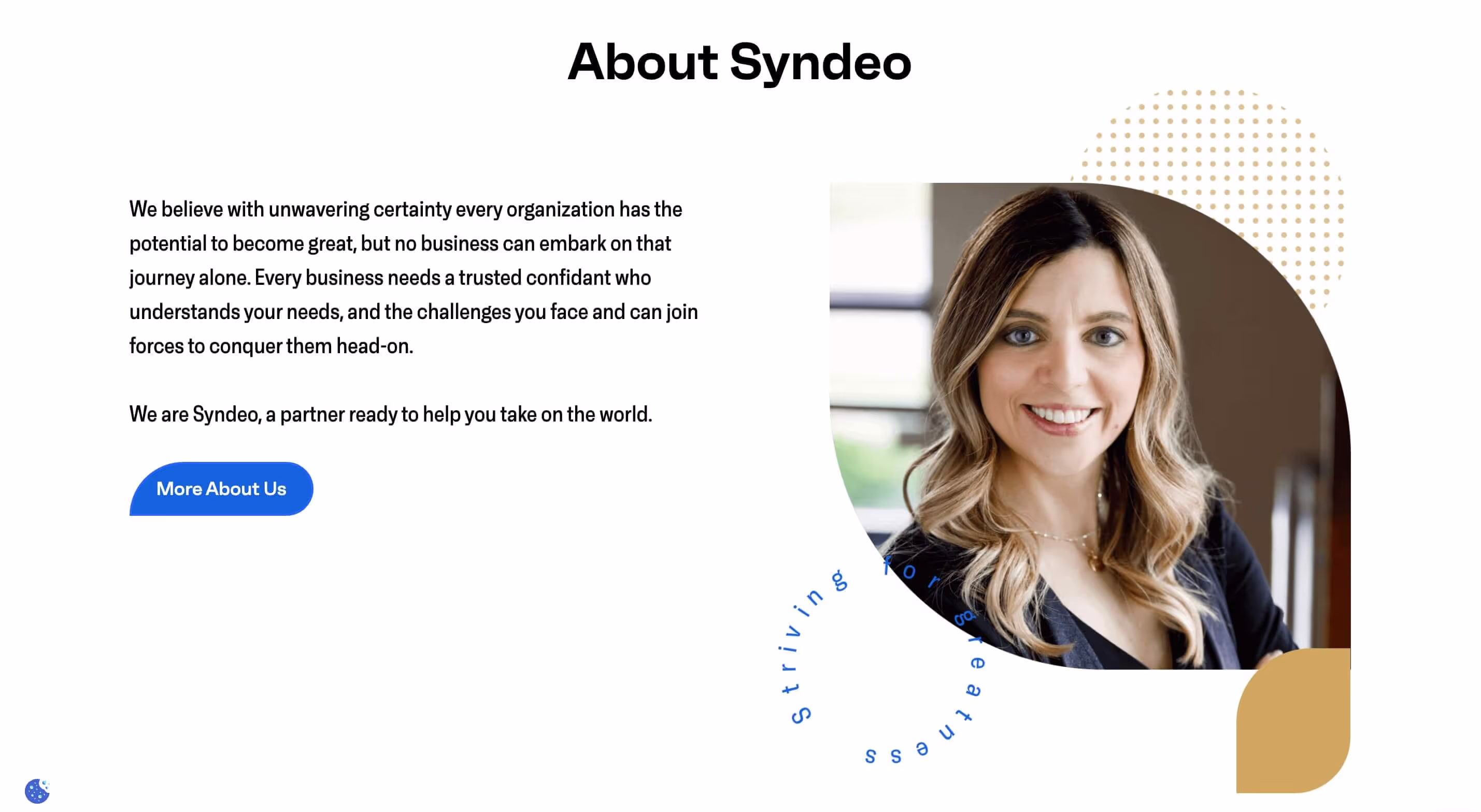
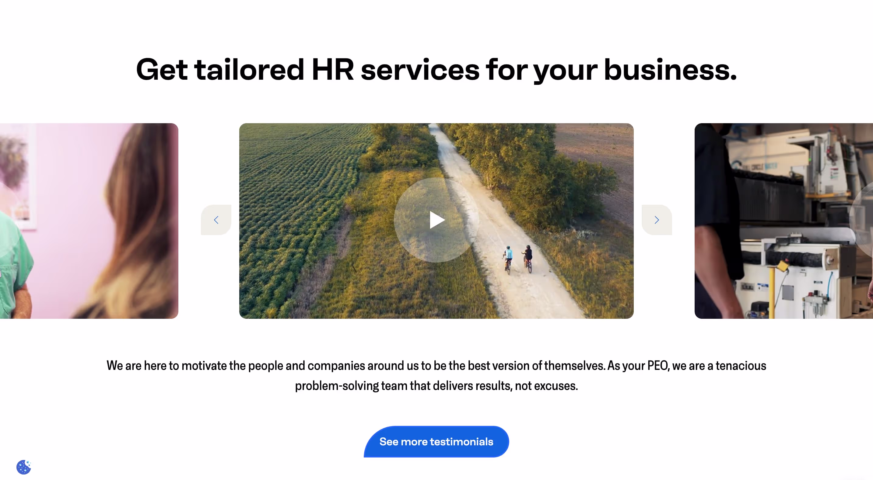
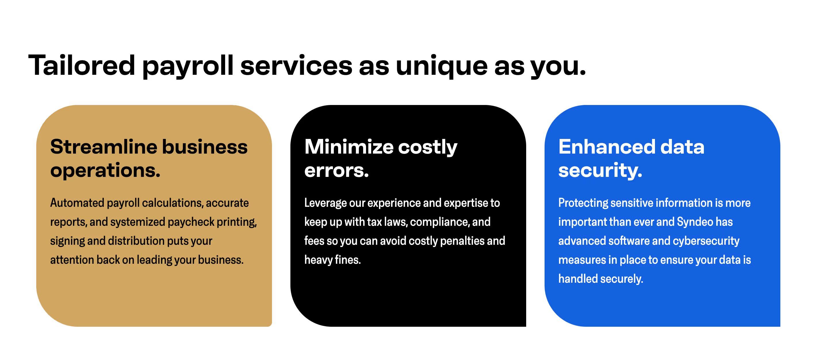
Syndeo HR Solutions' original website struggled to clearly differentiate itself from competitors in the PEO market and lacked an effective way to showcase the value of their tailored HR solutions. The messaging focused on general HR outsourcing benefits rather than highlighting Syndeo’s specific expertise, client focus, and commitment to personalized service. Potential clients had difficulty understanding the tangible advantages of a PEO relationship with Syndeo, leading to decreased lead conversions and inquiries.
Solution
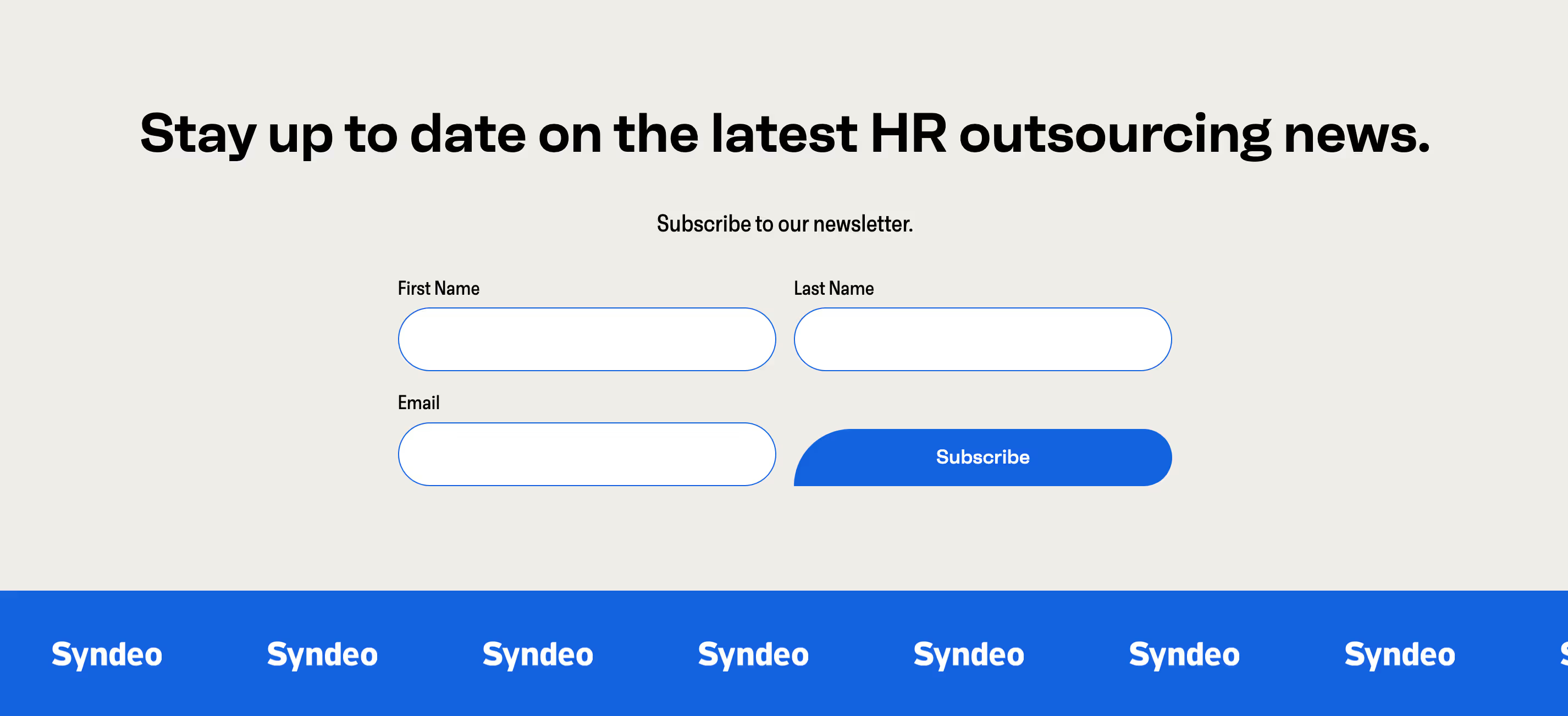
Emphasize personalized solutions and client-centric value. Targeted messaging refined website copy to directly address the pain points of business owners struggling with HR tasks, compliance, and employee management. Created dedicated pages for each core service area (HR, payroll, benefits, risk management) to showcase comprehensive expertise. Prominently displayed client testimonials and success stories to build trust and demonstrate real-world impact. Integrated clear CTA's to capture qualified leads interested in HR outsourcing solutions.
Outcome
- 68% Improvement in platform navigation and overall ease of use.
- 80% improved user feedback on improved personalized learning paths
- 61% increase in user engagement and platform interaction


.avif)
.avif)


.avif)
.avif)
.avif)


.avif)
.avif)
.avif)

.avif)
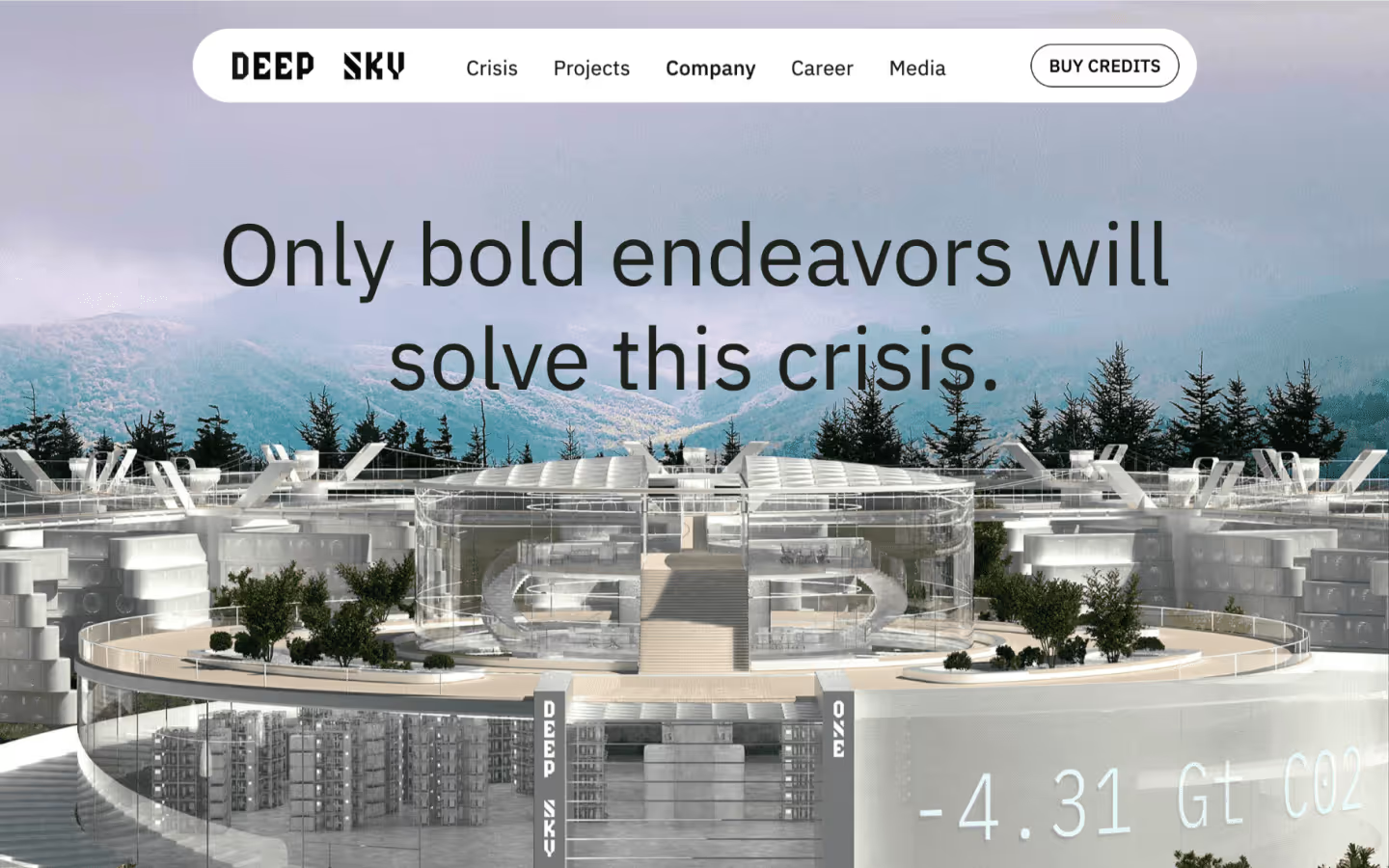
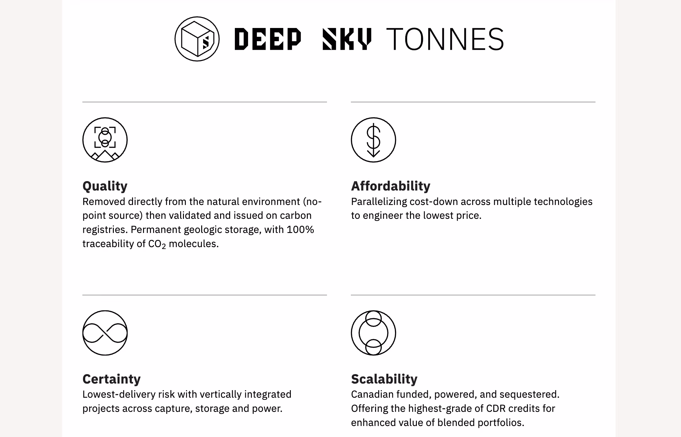
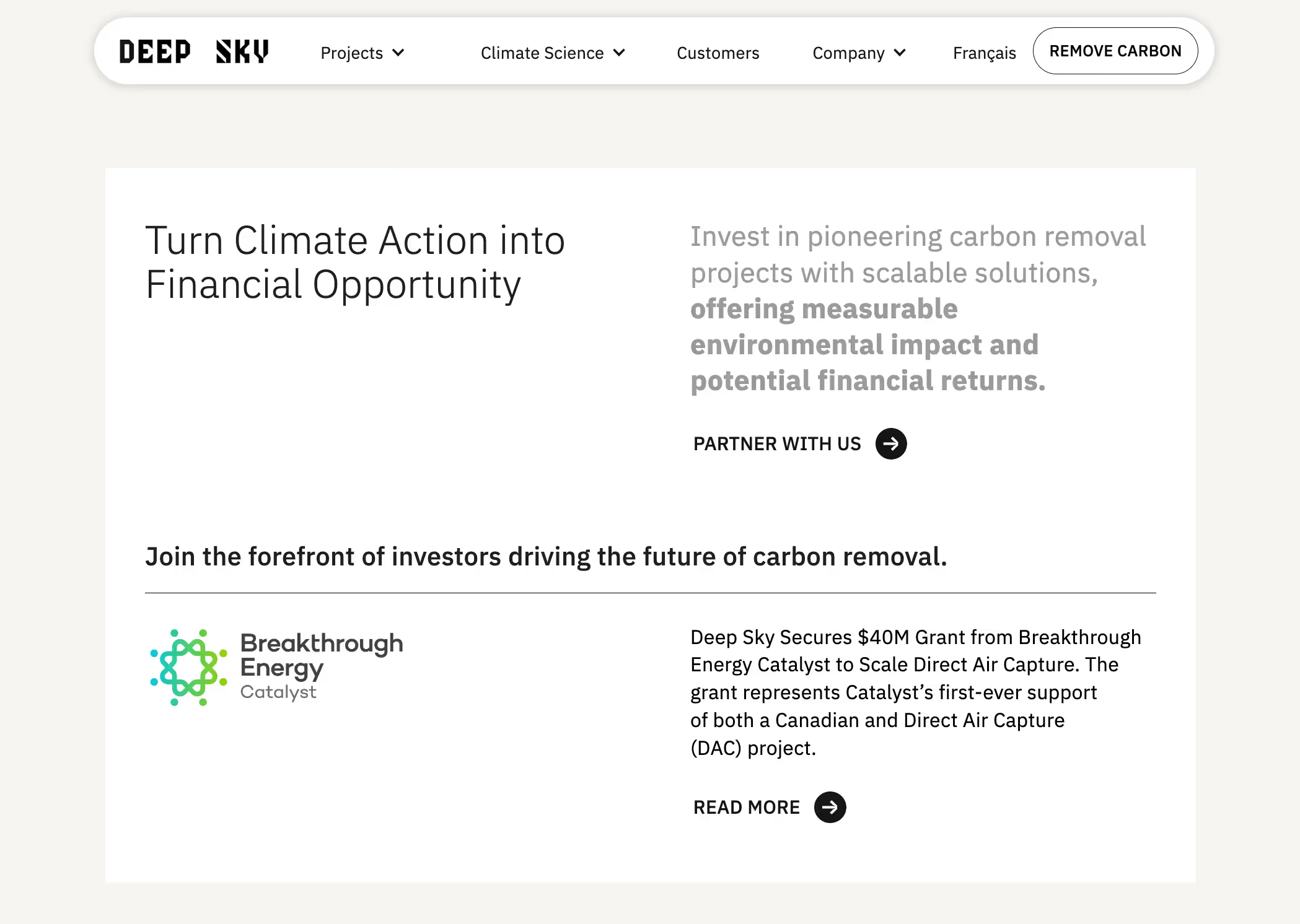
Challenge
Deep Sky Climate's initial website struggled to effectively convey the technological complexity and long-term value of their carbon removal projects. The site required more in-depth information to showcase their "technology agnostic" approach, diverse partnerships, and the scalability of their projects. This lack of clear messaging and detailed project information hindered their ability to attract major investors and carbon removal buyers, impacting their ability to scale operations.
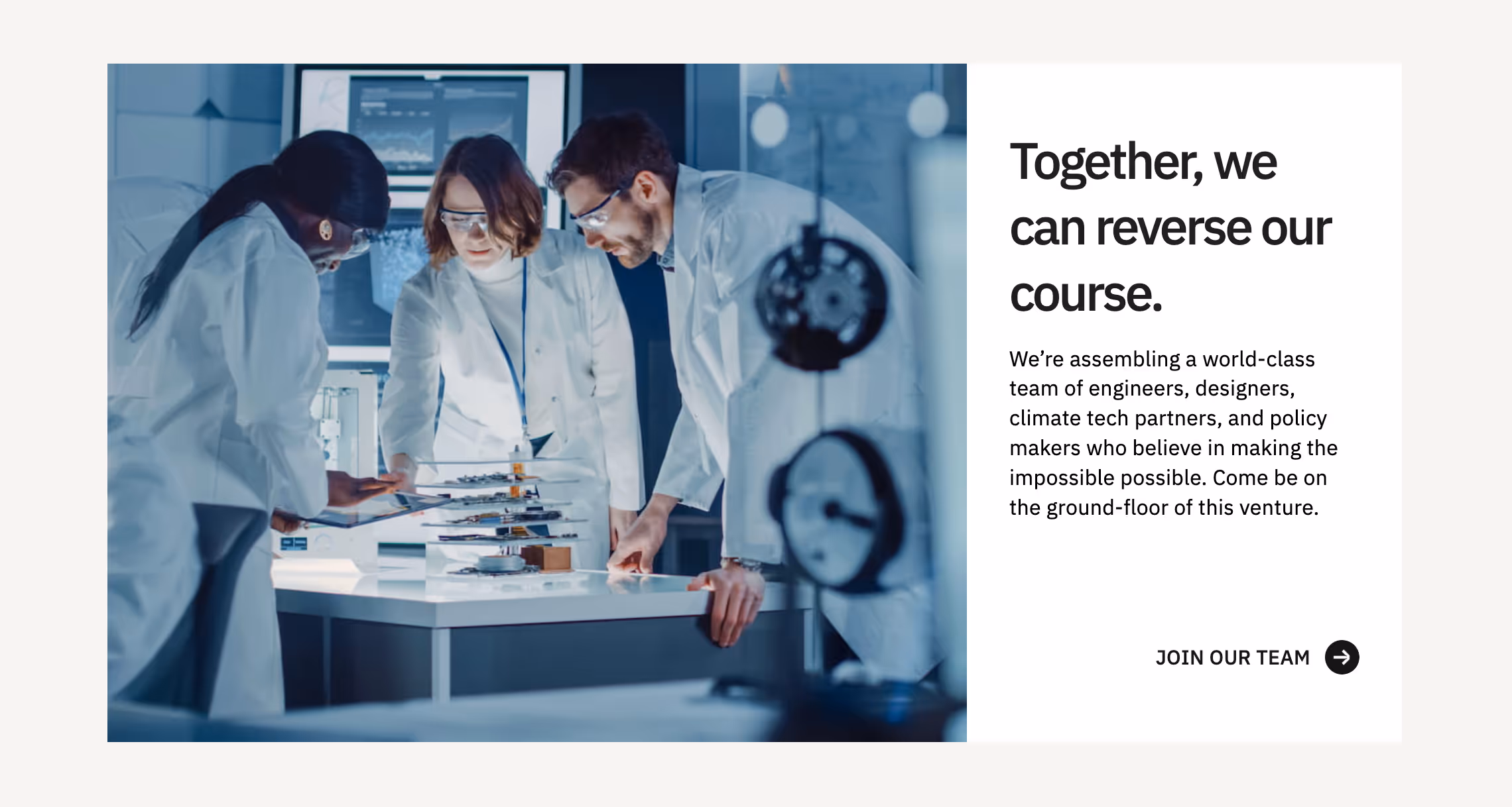
Solution
Prioritize transparency, credibility, and investment opportunity. Dedicated pages for each project site (e.g., Deep Sky Alpha), outlining the technologies being tested, the location's advantages (geology, energy access), and project timelines. Partnerships with Microsoft, RBC, & Breakthrough Energy Catalyst, highlighting their endorsements and investments as validation of Deep Sky's approach. Clearly explained the "technology agnostic" approach, emphasizing the diversification of risk and potential for cost reduction by testing multiple Direct Air Capture (DAC) technologies simultaneously. Dedicated investor relations section that outlines the financial opportunity, projected returns, and the scalability of their carbon removal projects, along with contact information for investor inquiries.
Outcome
- 68% Improvement in platform navigation and overall ease of use.
- 80% improved user feedback on improved personalized learning paths
- 61% increase in user engagement and platform interaction


.avif)


.avif)


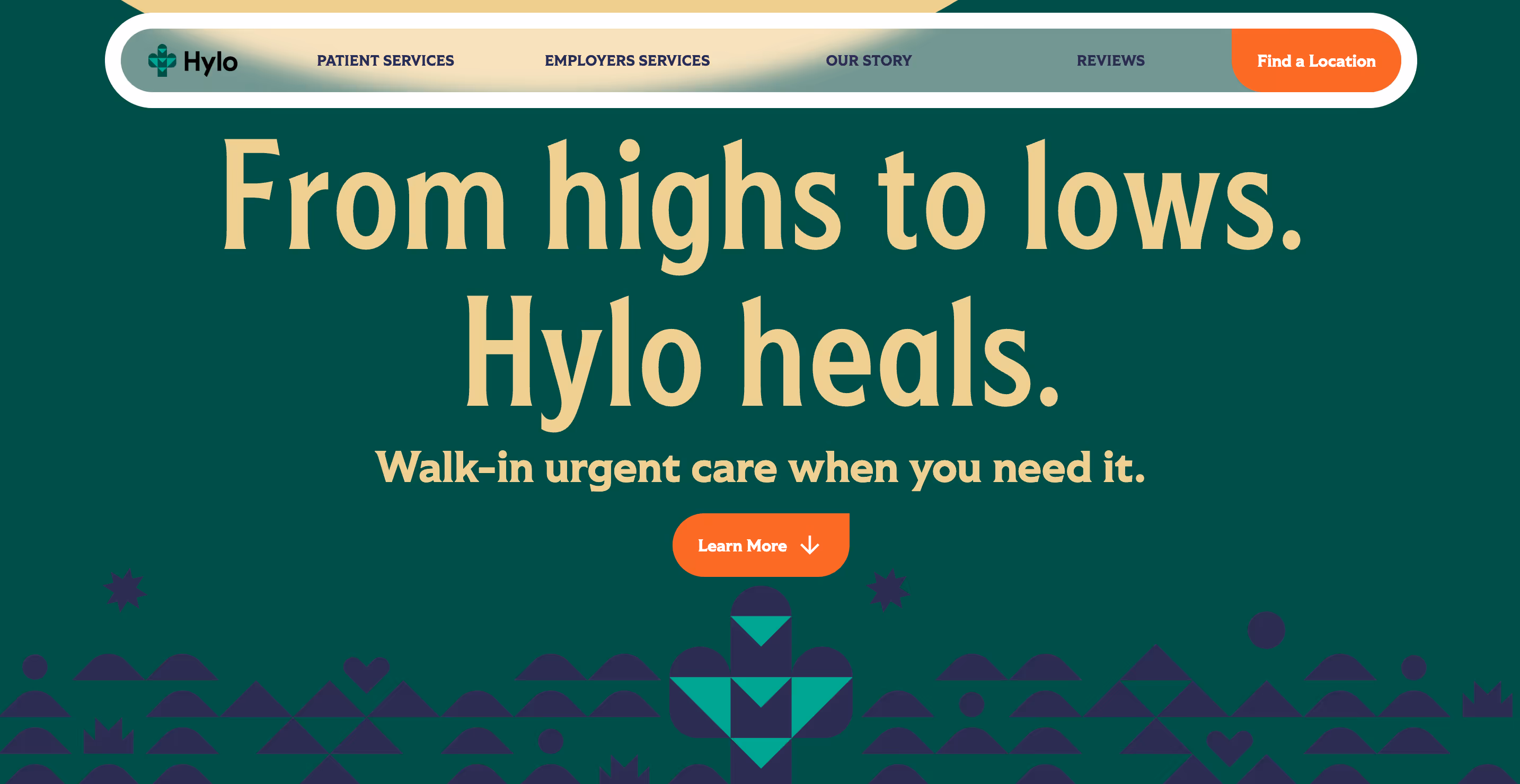
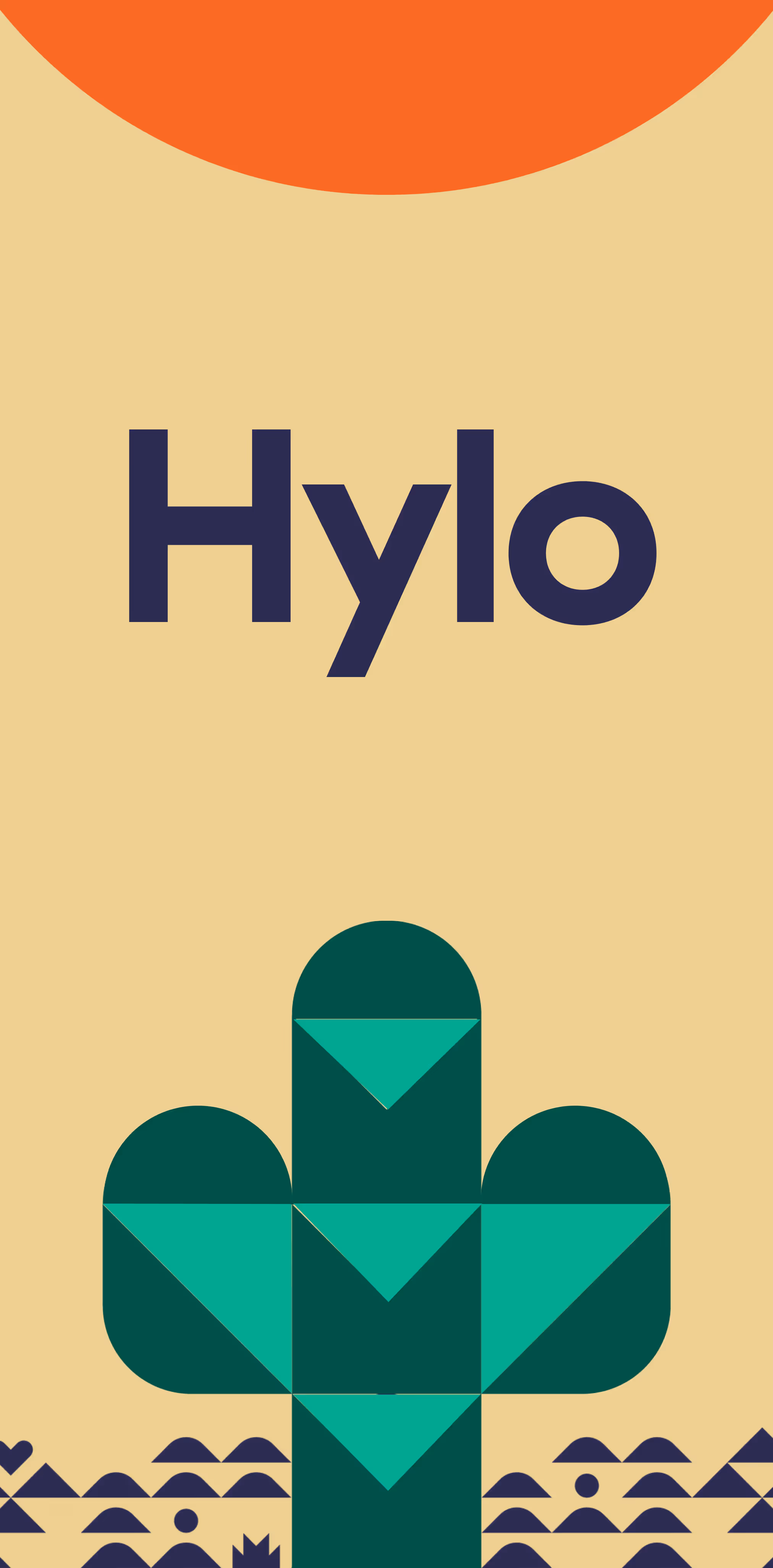
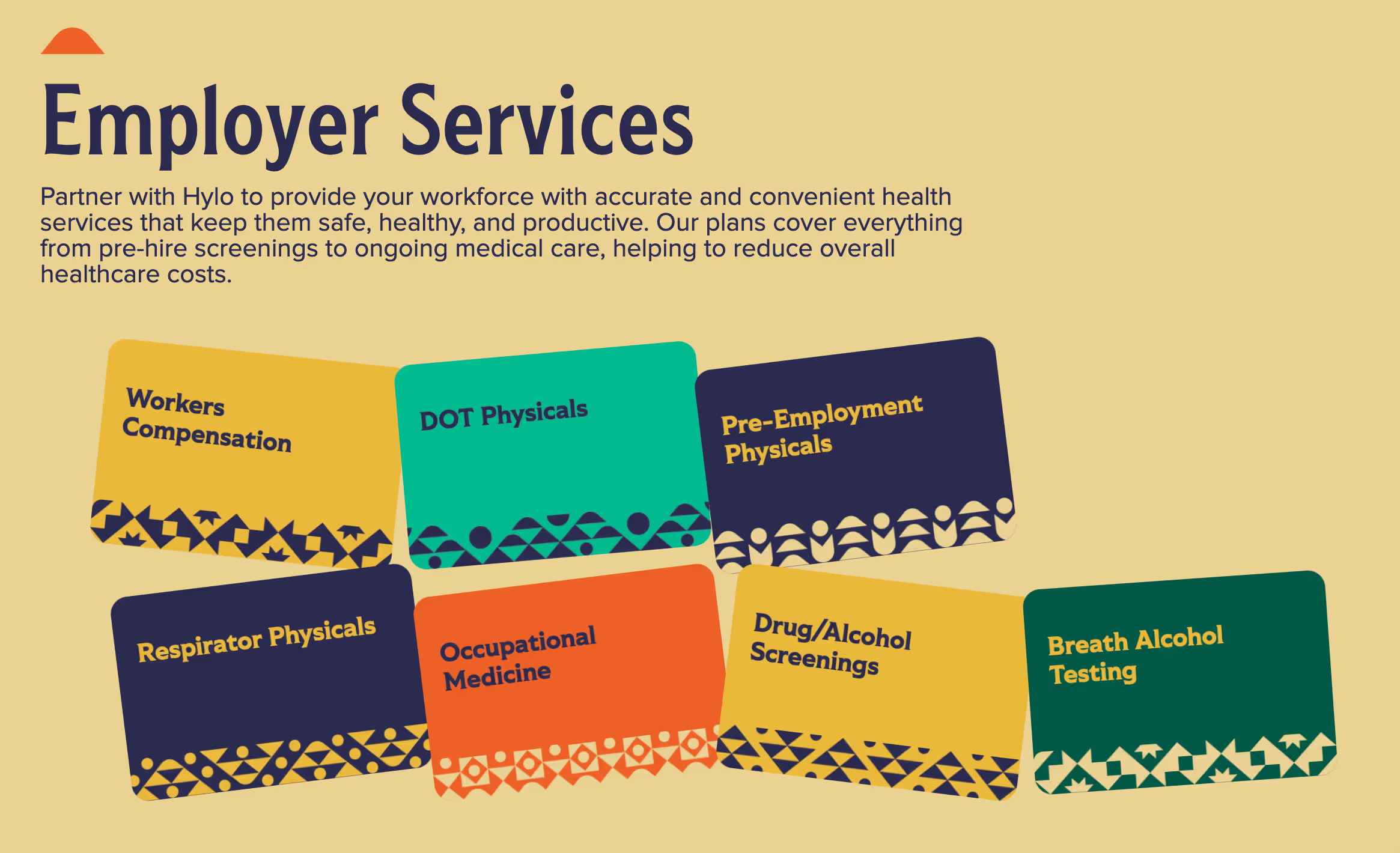
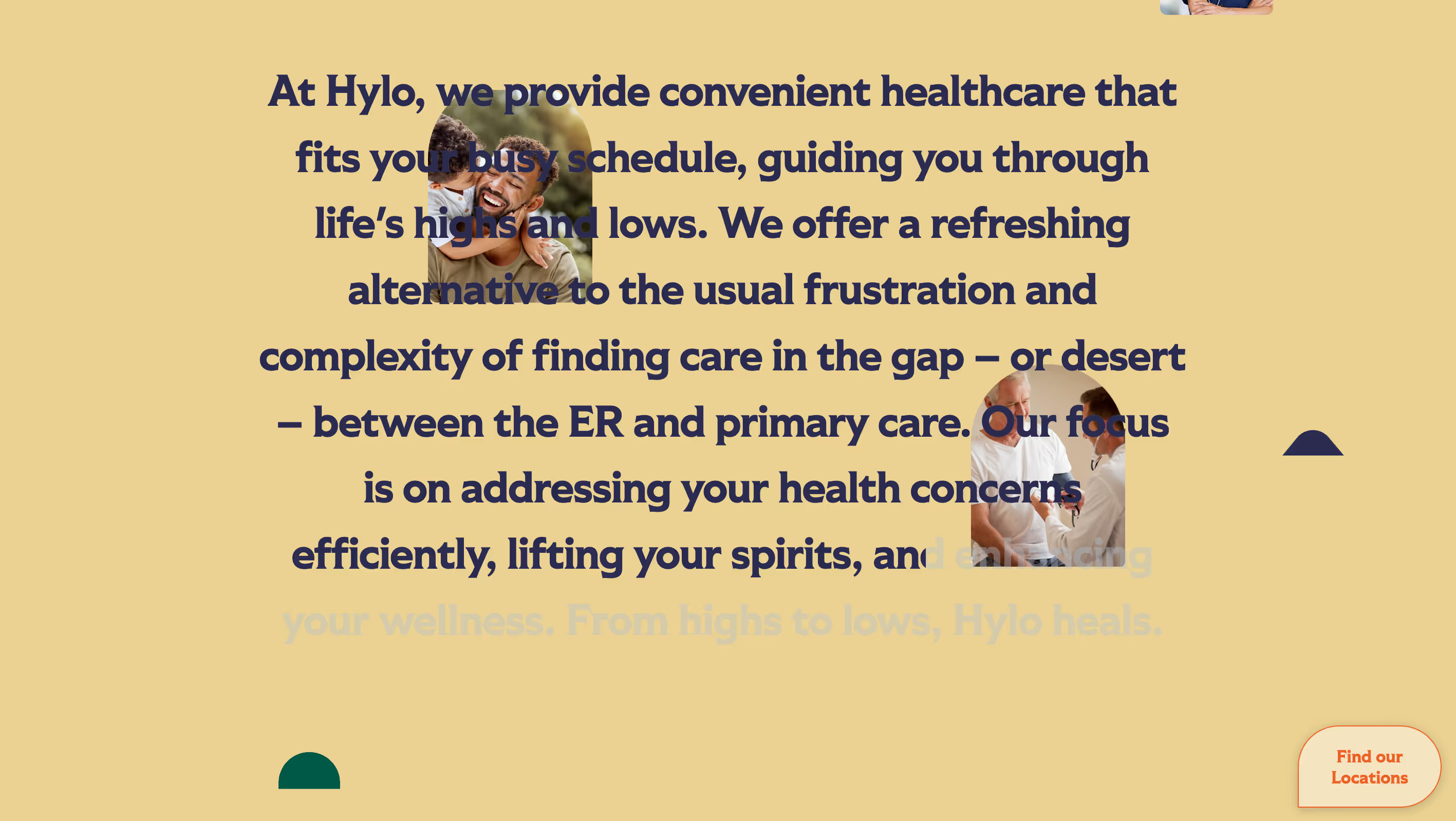
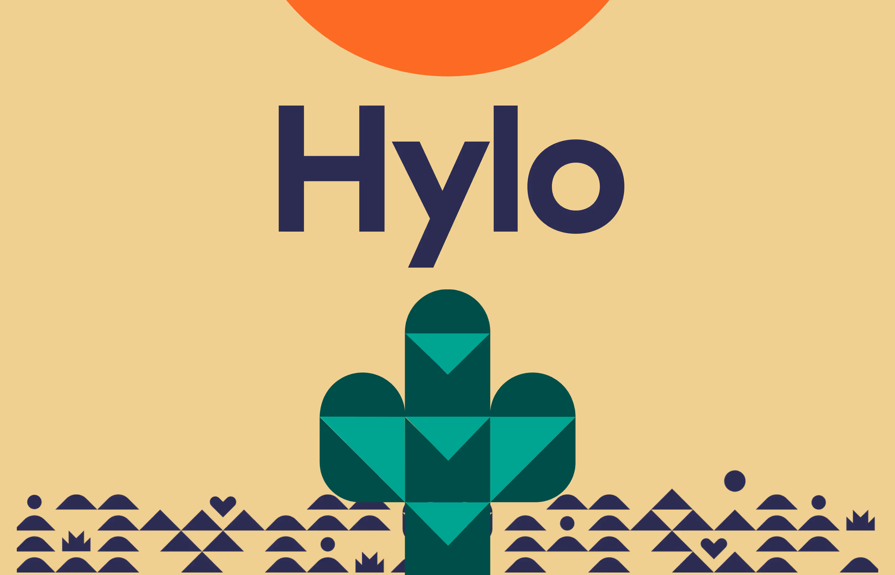
Challenge
Hylo Urgent Care’s original website lacked clear navigation and accessible service information, making it difficult for patients to quickly identify urgent care locations, hours, or treatment options. The outdated design failed to emphasize their walk-in convenience and same-day care capabilities, potentially deterring patients seeking immediate medical attention.
Solution
Prioritize user urgency and transparency. Streamlined Navigation menus to highlight walk-in availability, location finders, and common urgent care services. Added service clarity listing treated conditions and on-site capabilities (e.g., X-rays, lab tests). Responsive design for seamless access to wait times, directions, and contact forms on all devices.Trust-Building features including patient testimonials.
Outcome
- 68% Improvement in platform navigation and overall ease of use.
- 80% improved user feedback on improved personalized learning paths
- 61% increase in user engagement and platform interaction


.avif)


.avif)
.avif)
.avif)


.avif)
.avif)
.avif)


.avif)
.avif)
.avif)


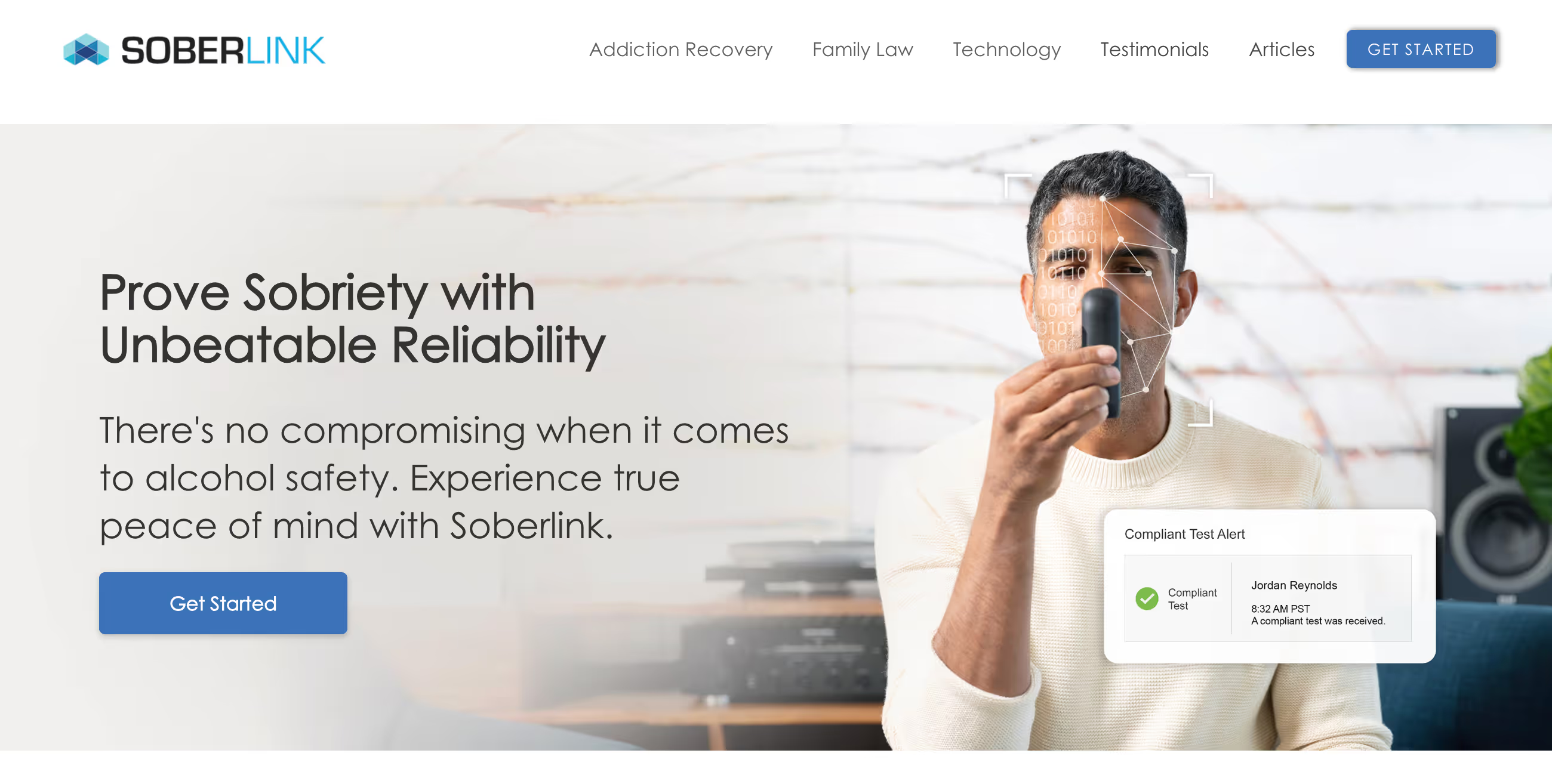
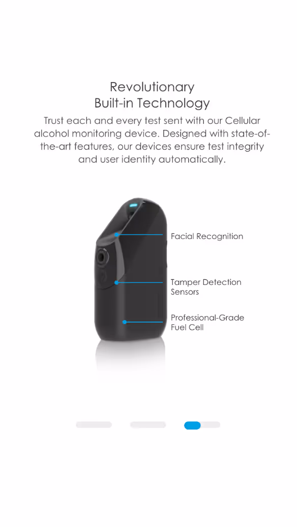
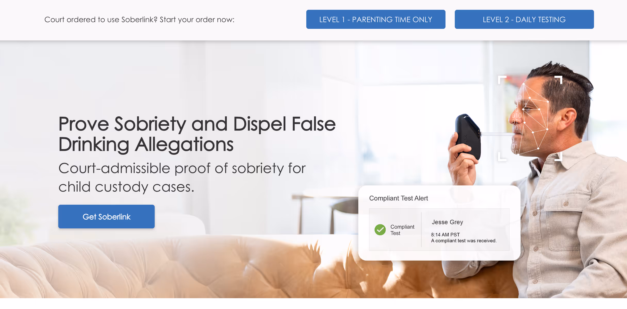
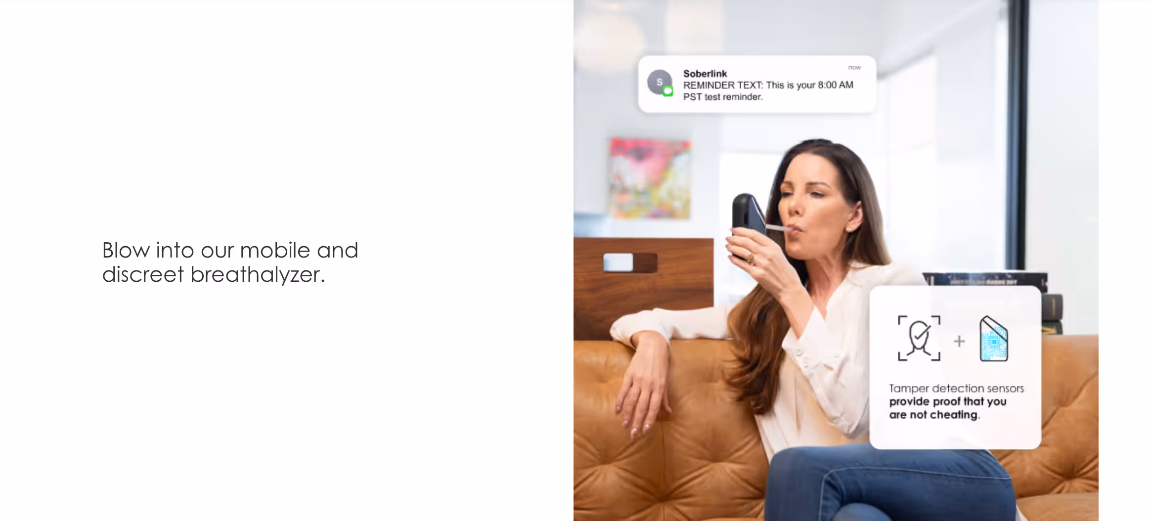
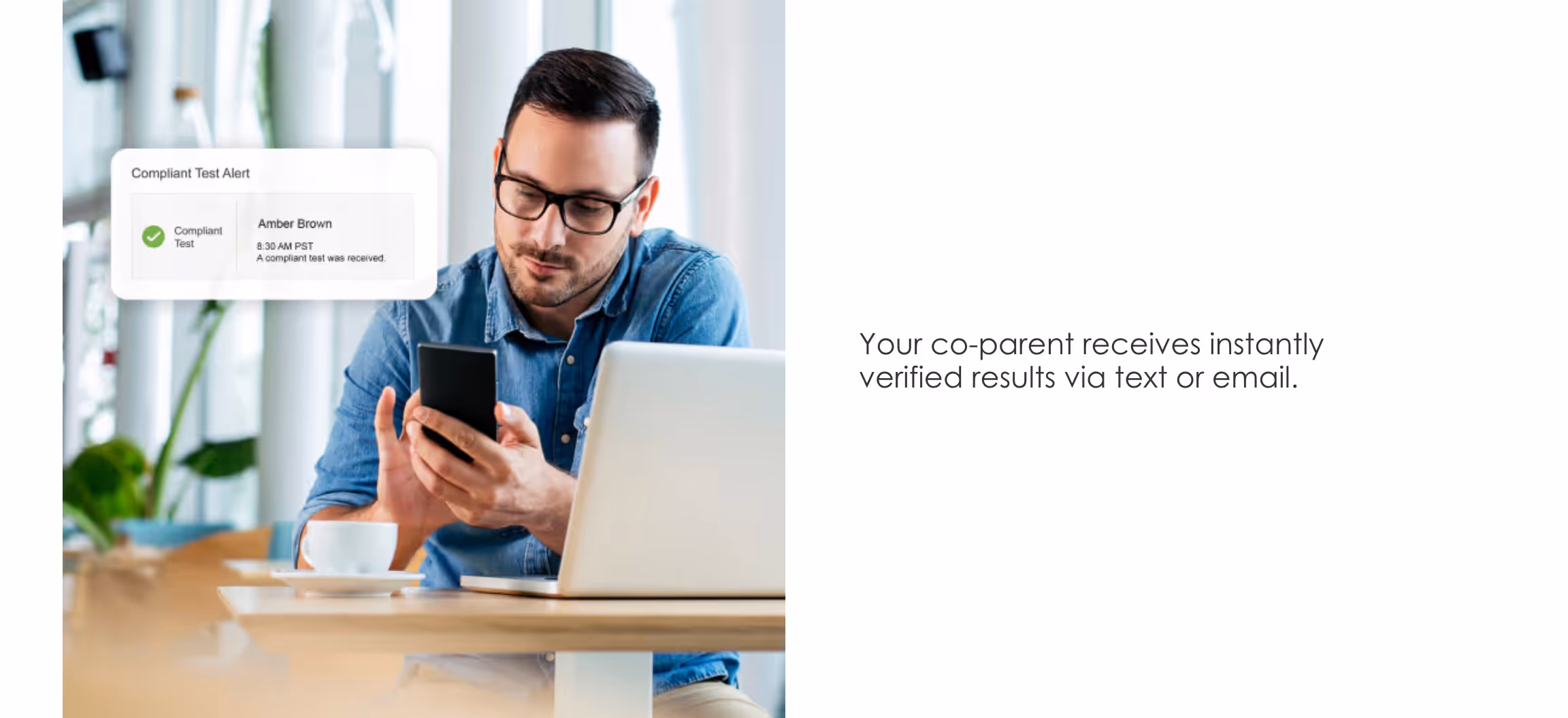
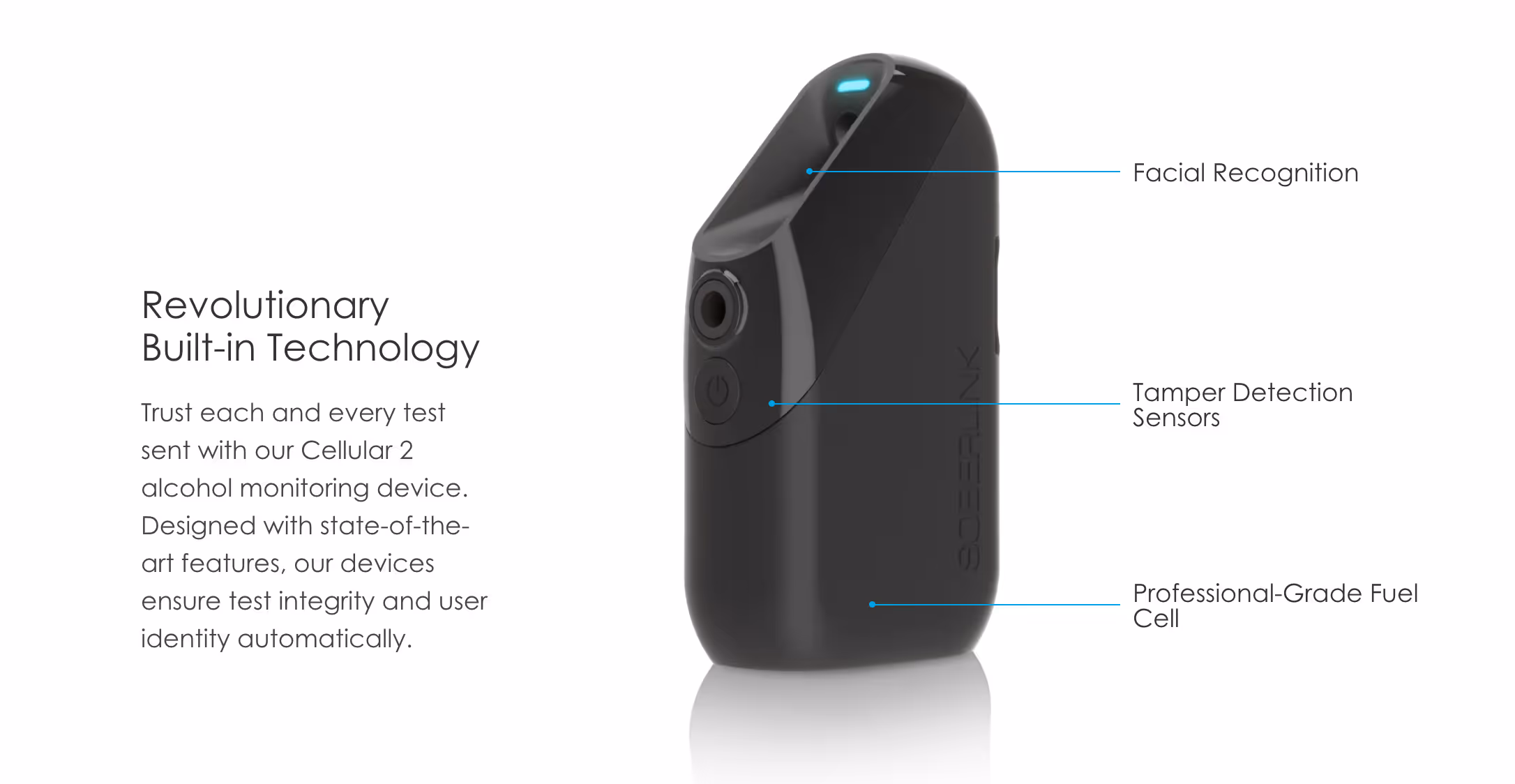
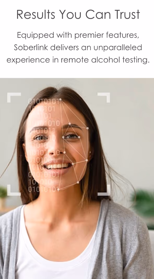
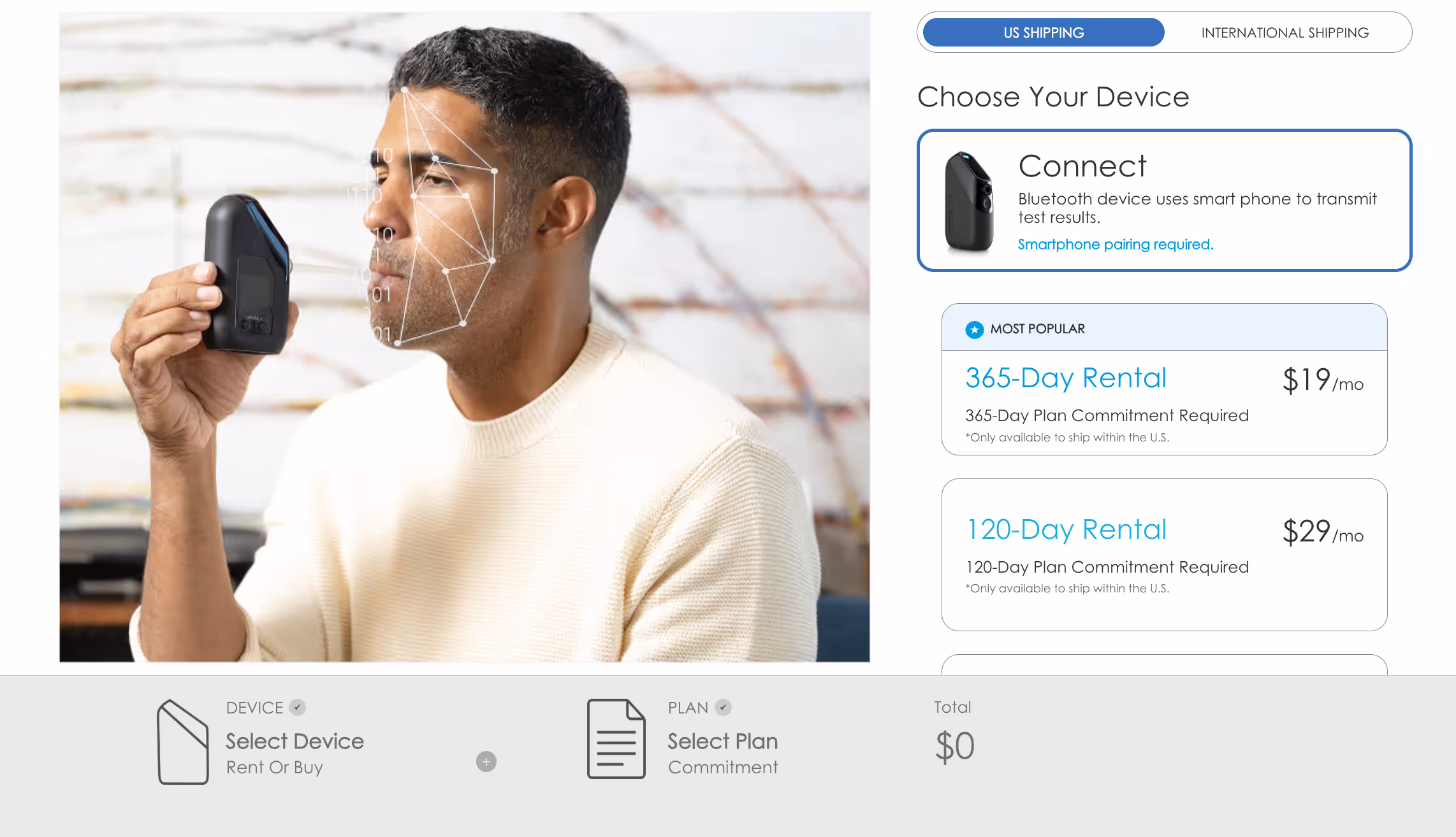
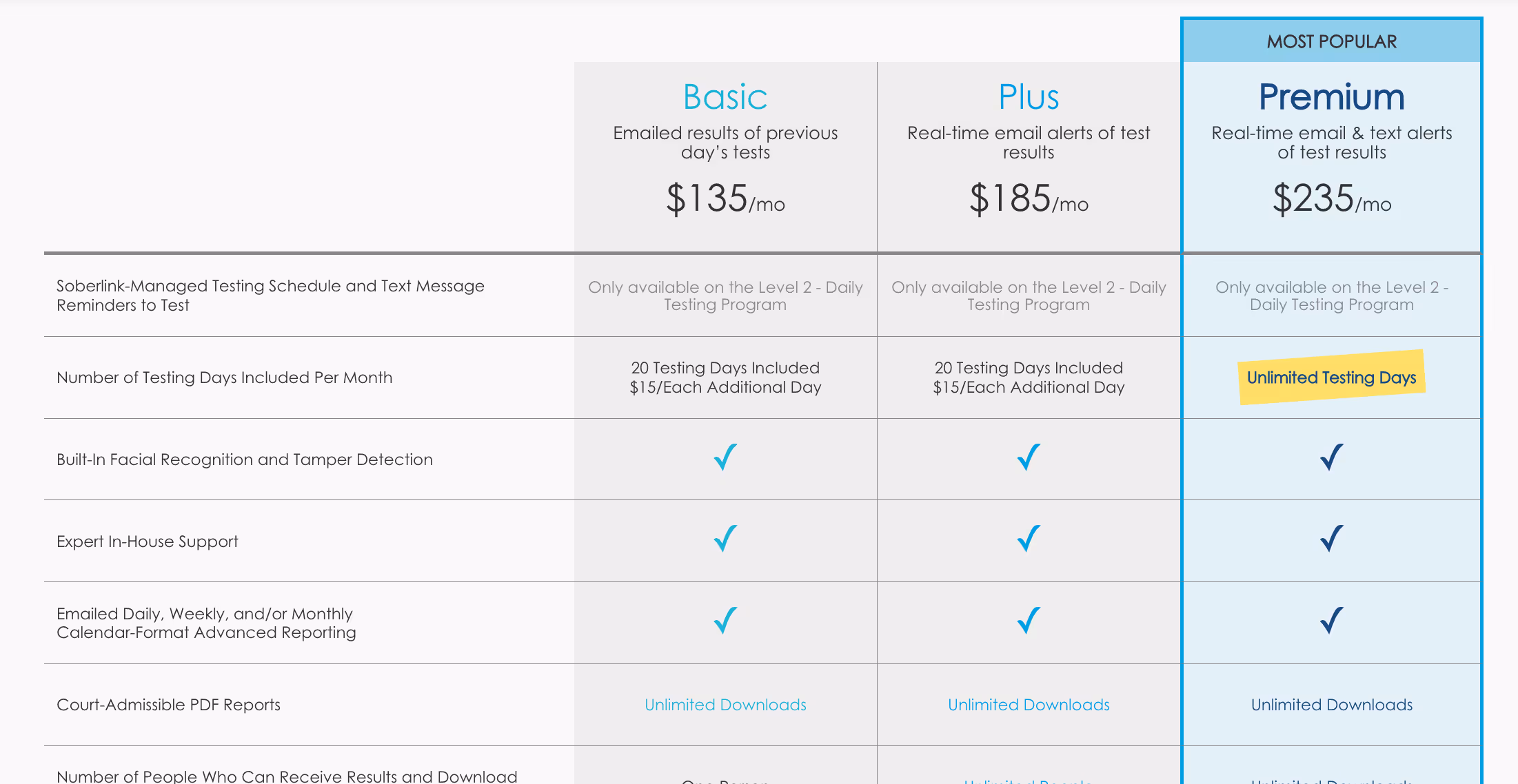
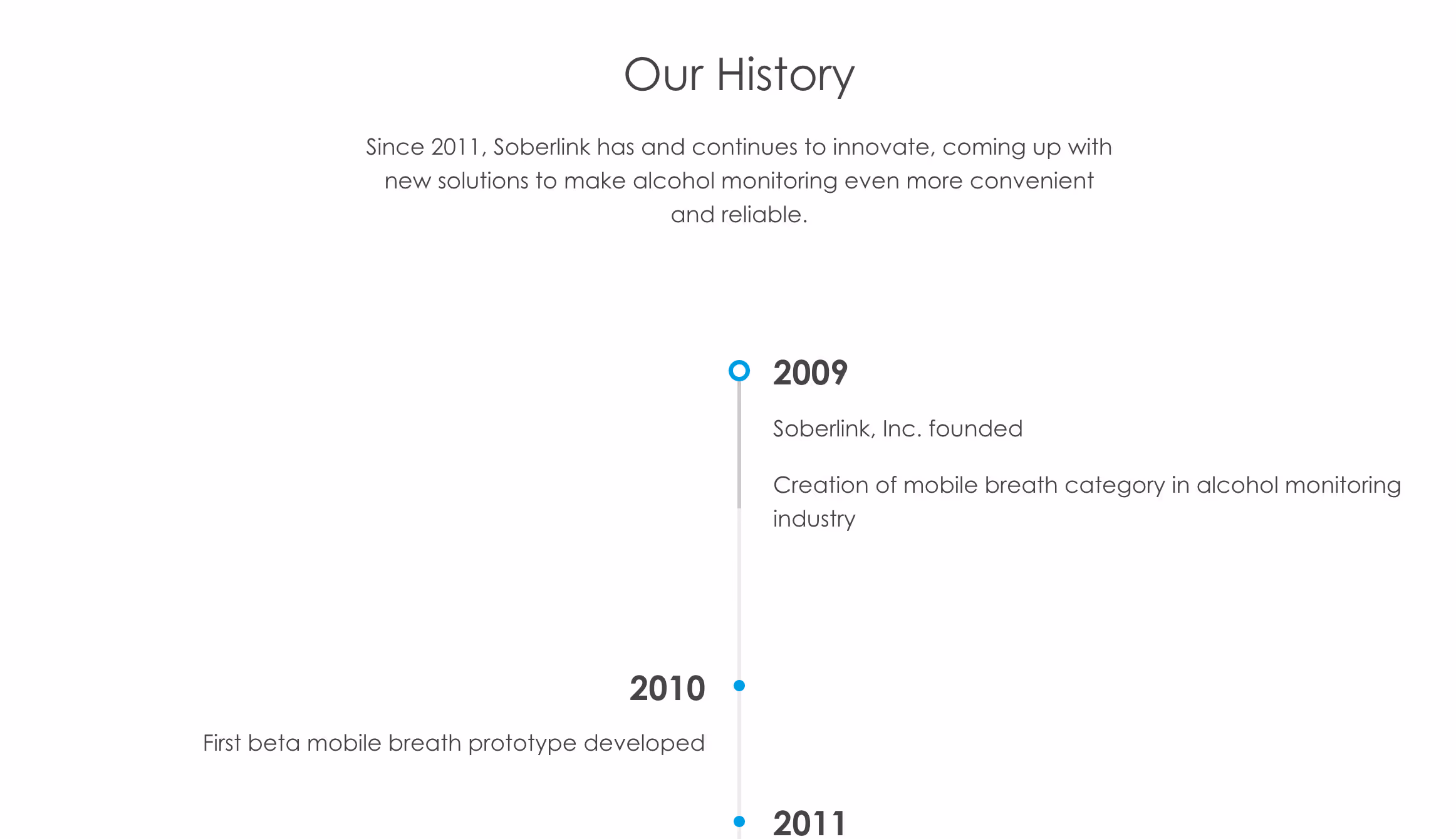
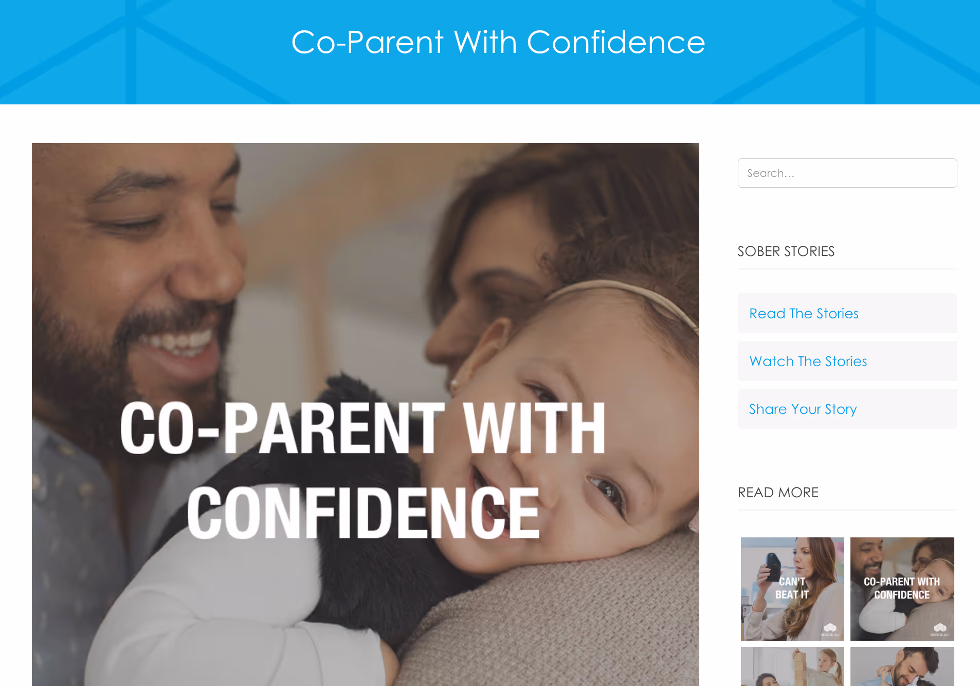
Challenge
Methods such as breathalyzers or urine tests can make it difficult for individuals in recovery or those who are court-mandated to maintain sobriety to monitor their sobriety.
Solution
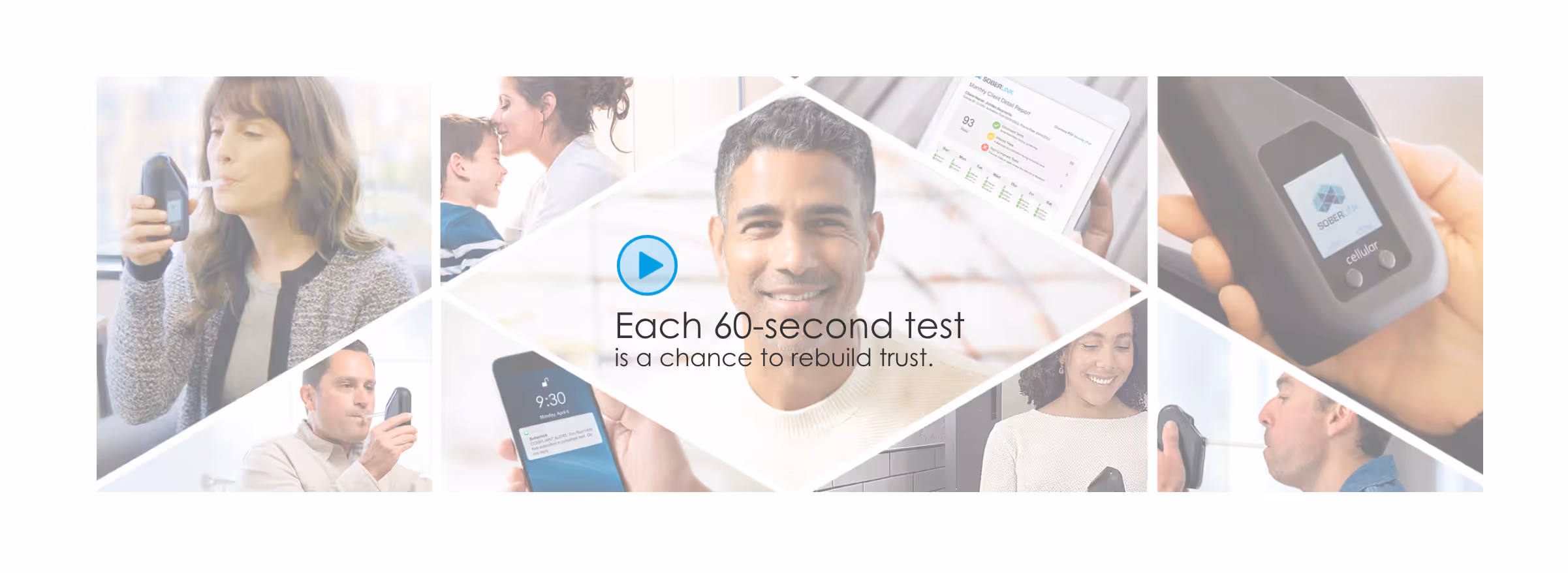
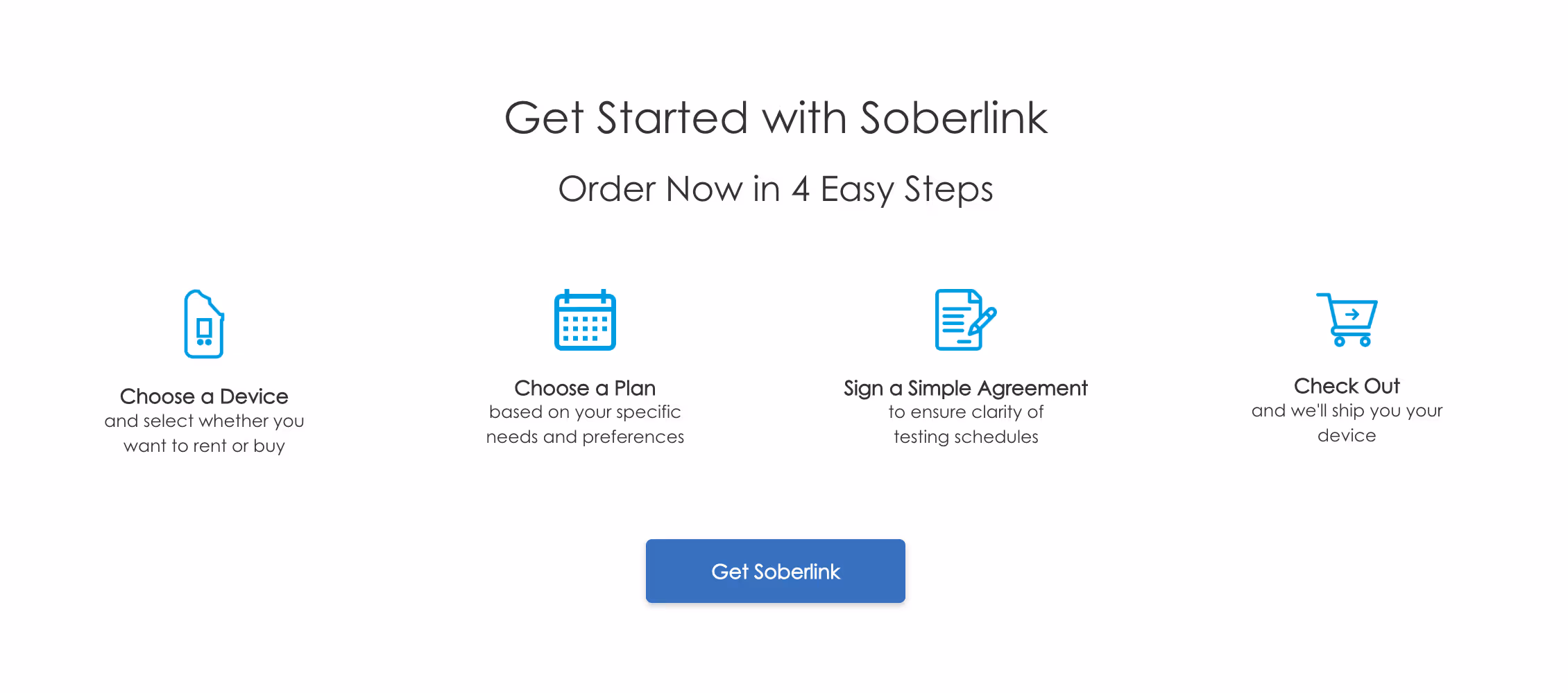
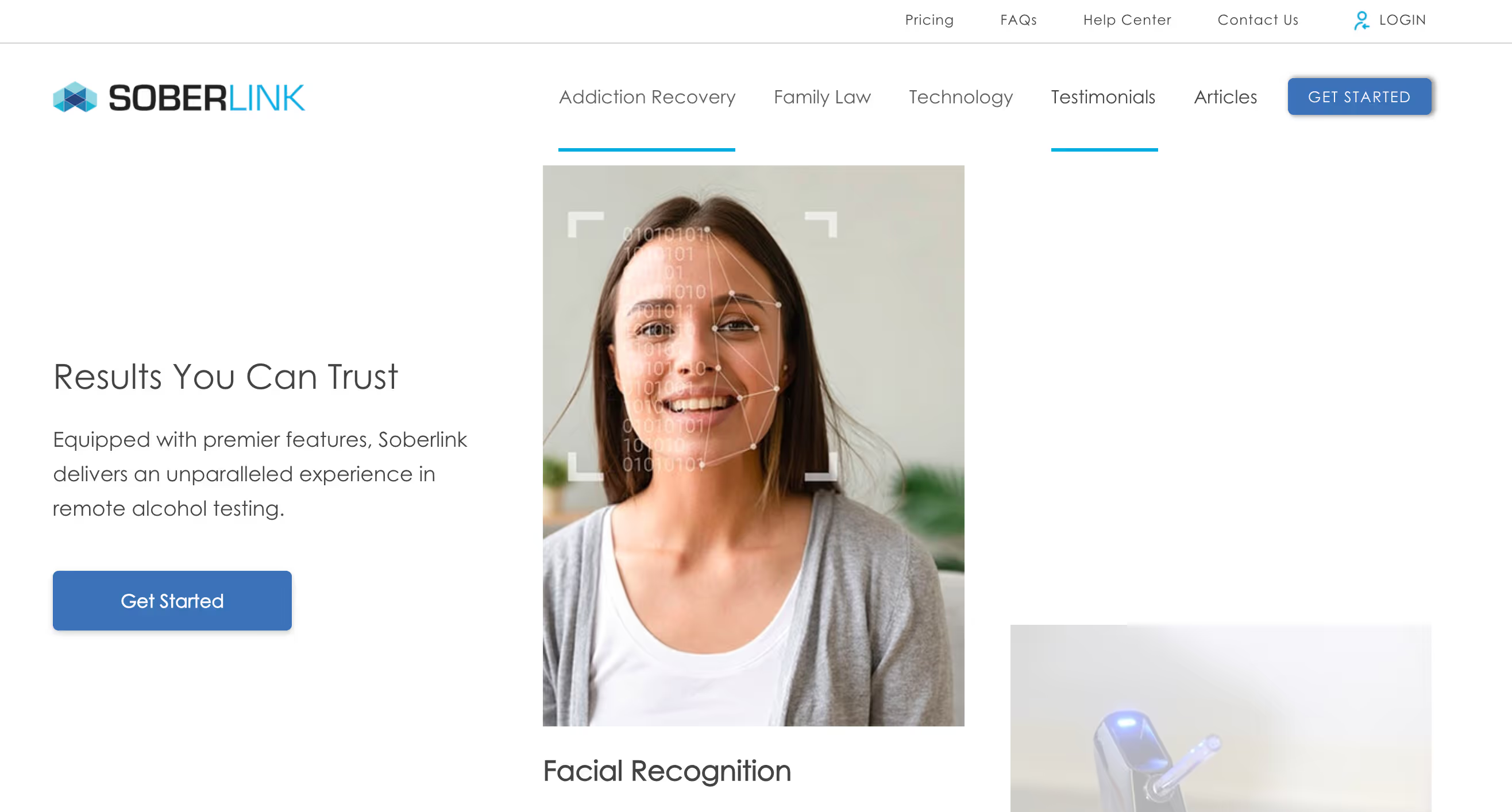
Prioritized user-centric navigation and community-driven storytelling. Streamlined User Experience restructured content into distinct sections (Healthcare & Family Law) for easy access to relevant resources. Sober Stories Integration launched a community project where users share personal recovery journeys, fostering peer support & transparency. Enhanced Accessibility improved calls-to-action. Highlighted real-time monitoring technology with facial recognition and anti-tampering safeguards to emphasize reliability.
Outcome
- 68% Improvement in platform navigation and overall ease of use.
- 80% improved user feedback on improved personalized learning paths
- 61% increase in user engagement and platform interaction


Challenge
The previous website had a confusing navigation structure, making it difficult for users to find specific information about services and products, the visual design of the website was outdated and did not effectively showcase their innovative technology, leading to a less engaging user experience and much lower conversion rate.
Solution
Prioritize value communication and trust-building. Strategic messaging, crafting clear, concise messaging to emphasize their data-driven methodology, revenue growth focus, and experience with diverse B2B companies. Client showcase prominently displays client logos to demonstrate proven results and build credibility. Lead capture optimization implements strategic CTA. All-new design language to reflect cutting-edge approach.
Outcome
- 68% Improvement in platform navigation and overall ease of use.
- 80% improved user feedback on improved personalized learning paths
- 61% increase in user engagement and platform interaction


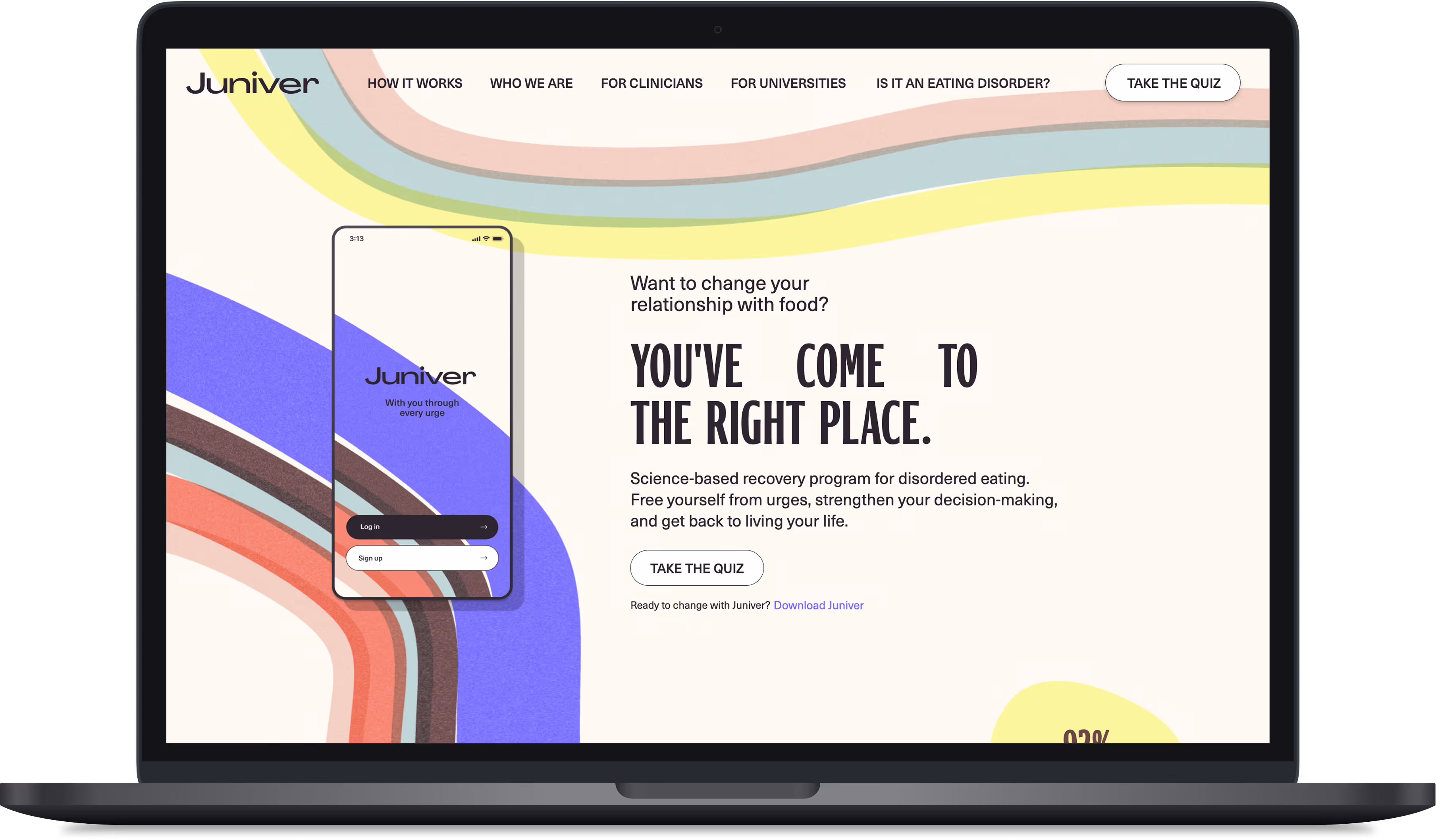
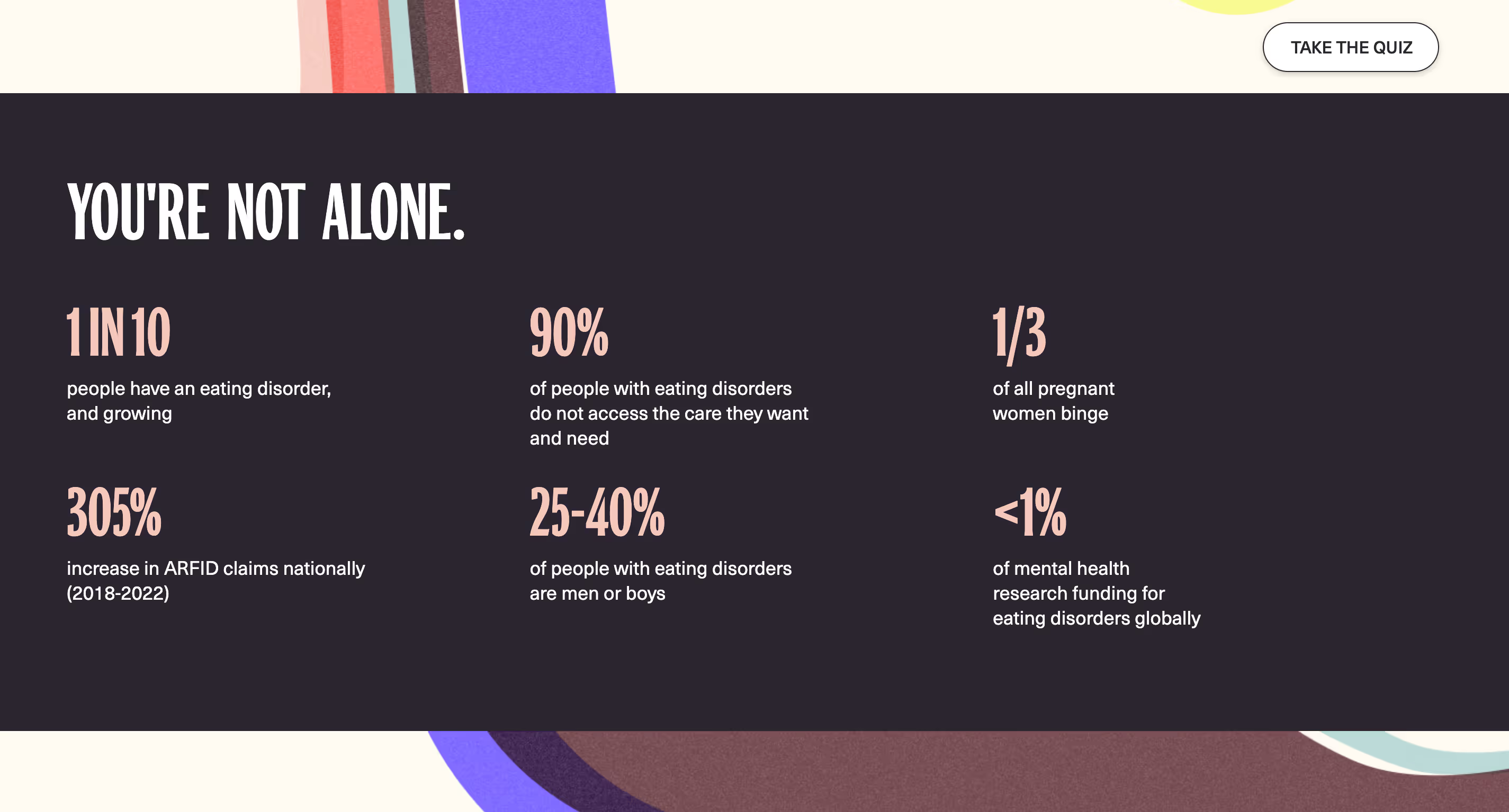
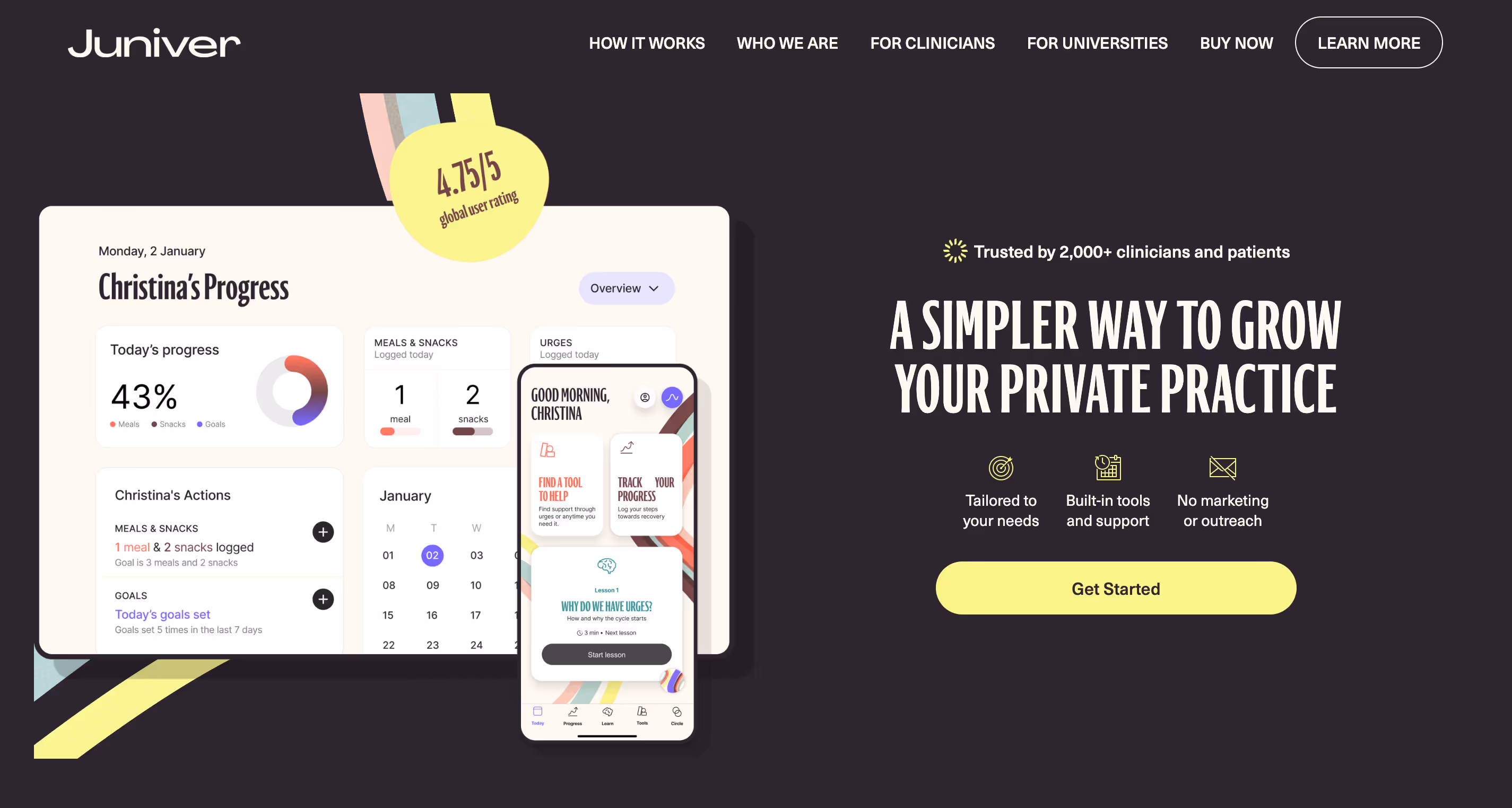
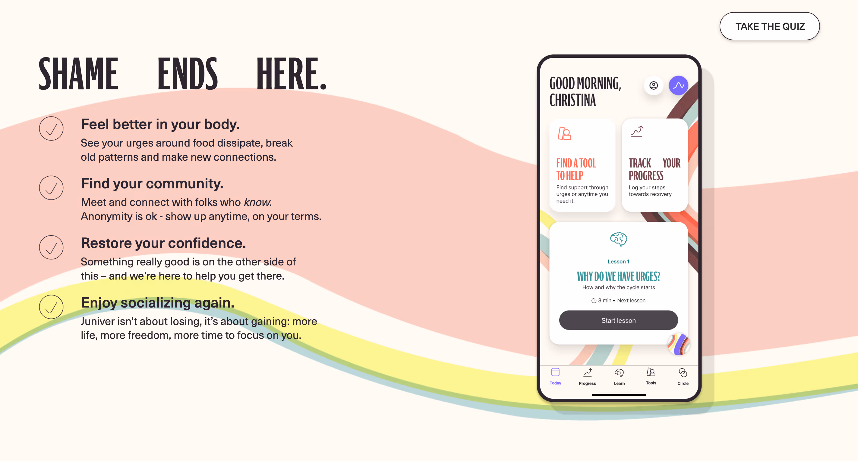
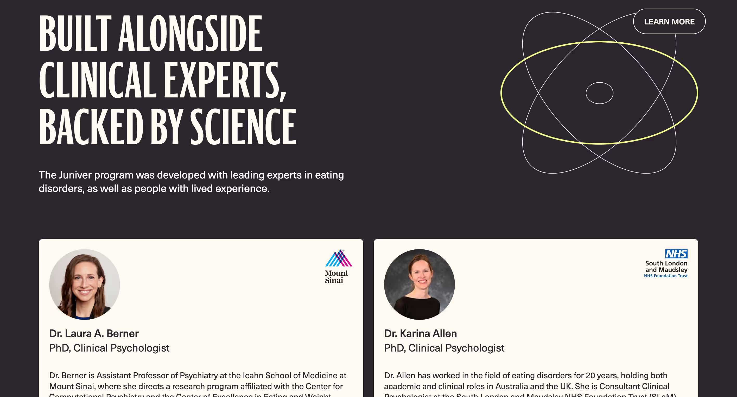
Challenge
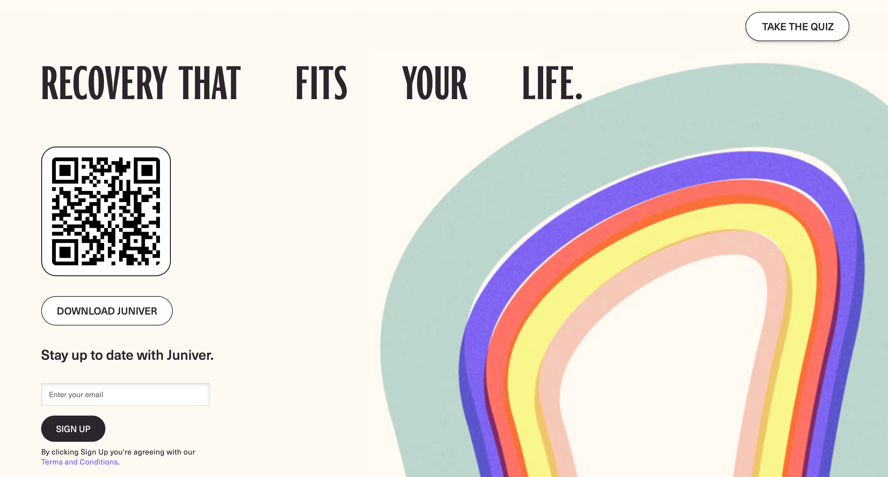
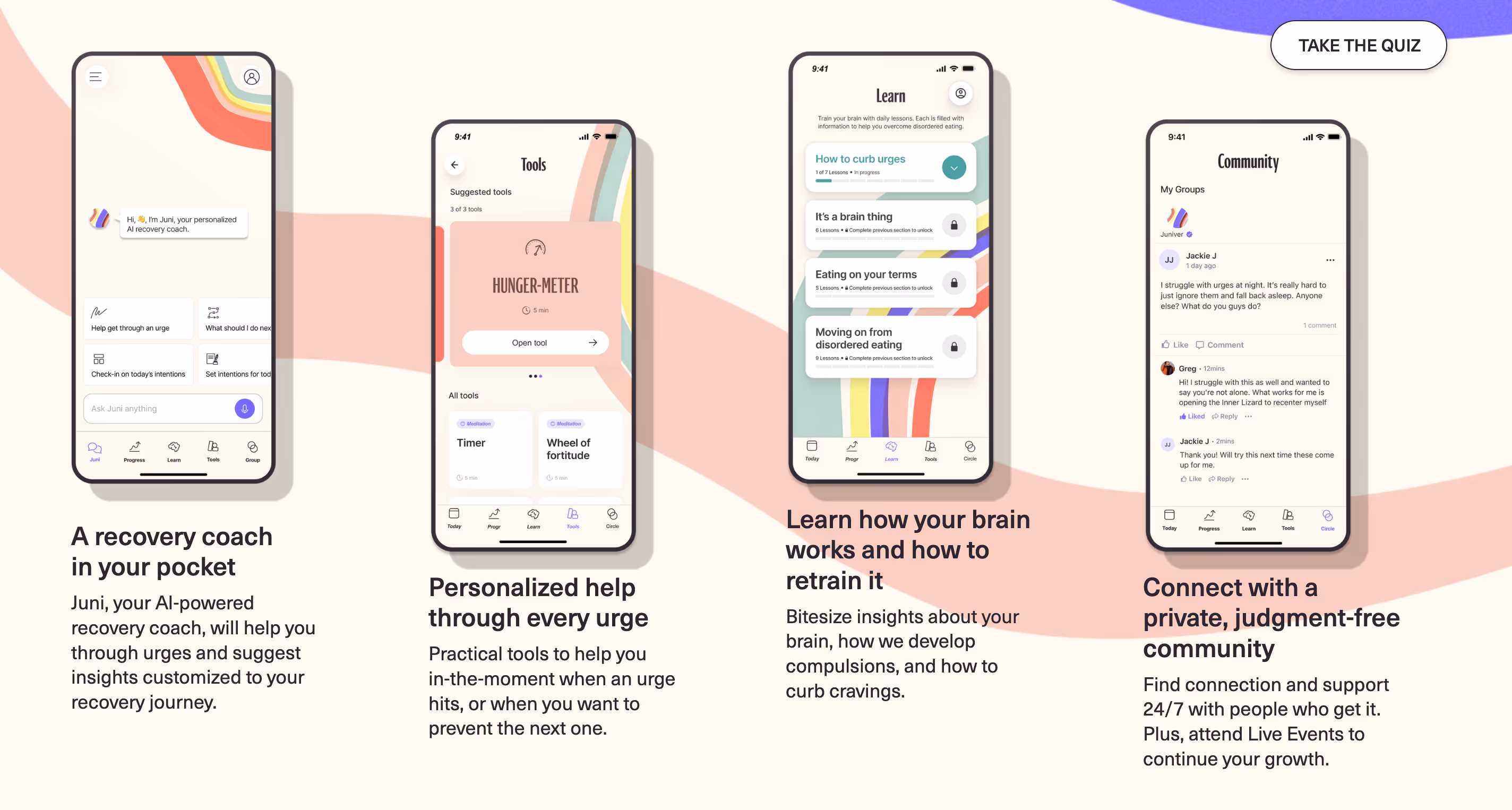
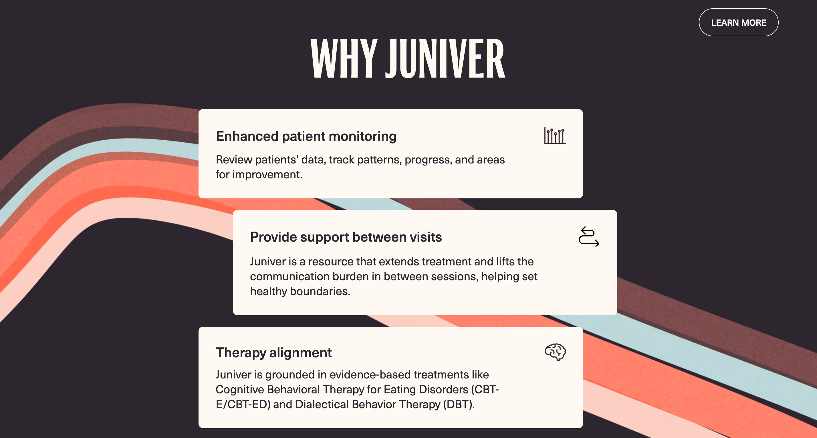
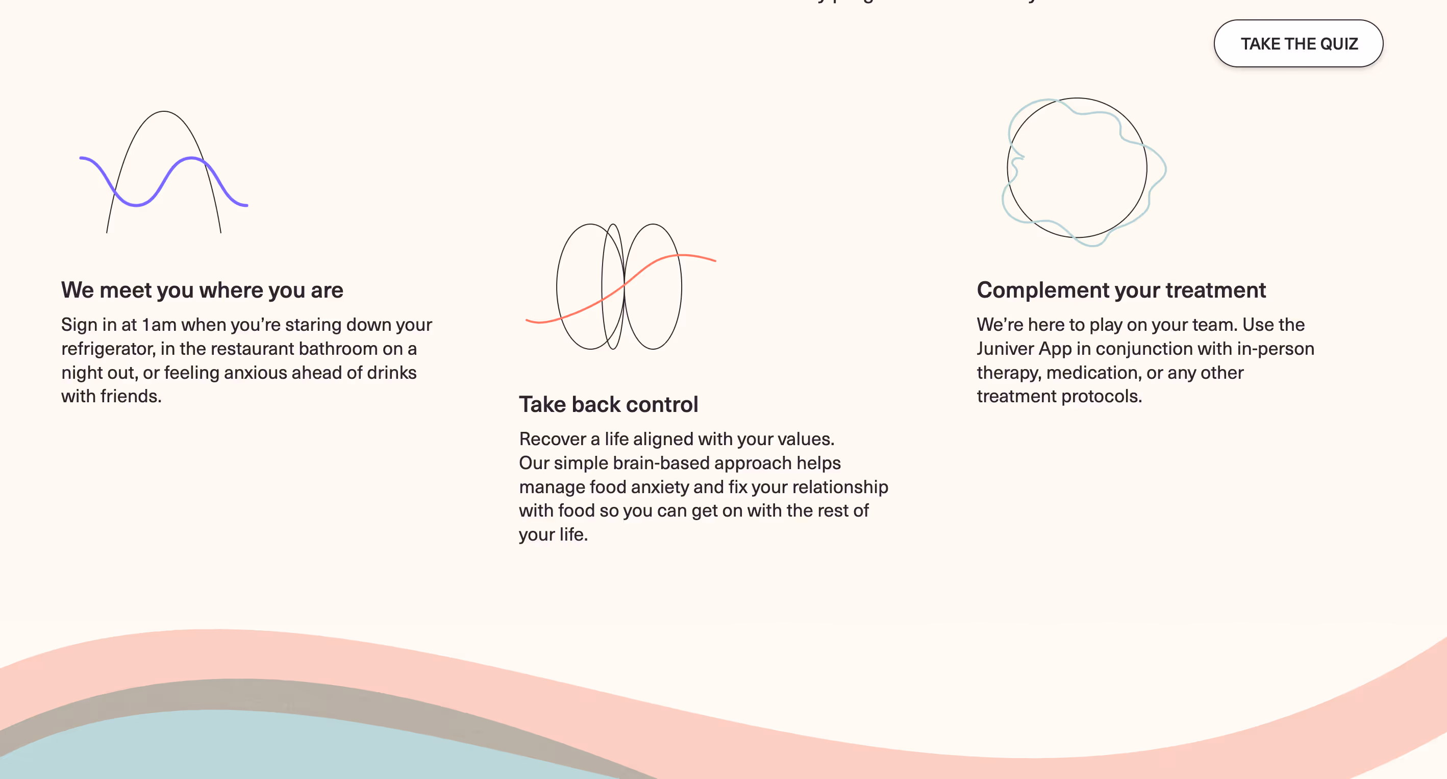
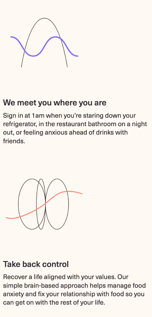
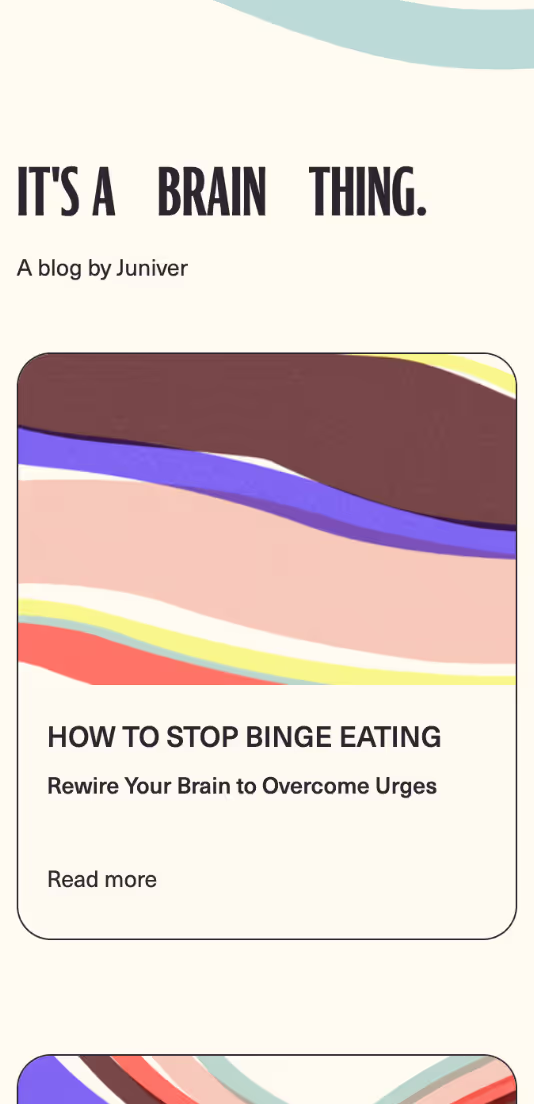
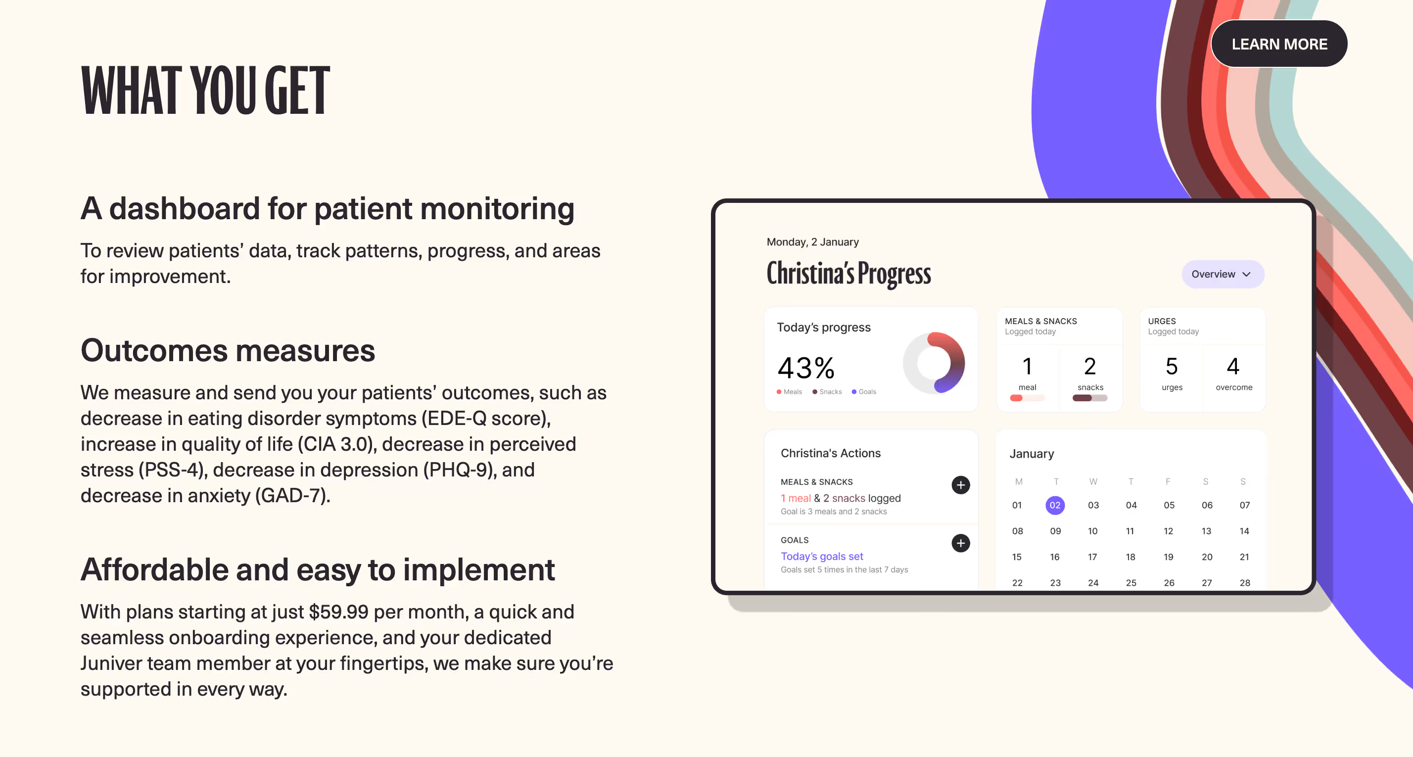
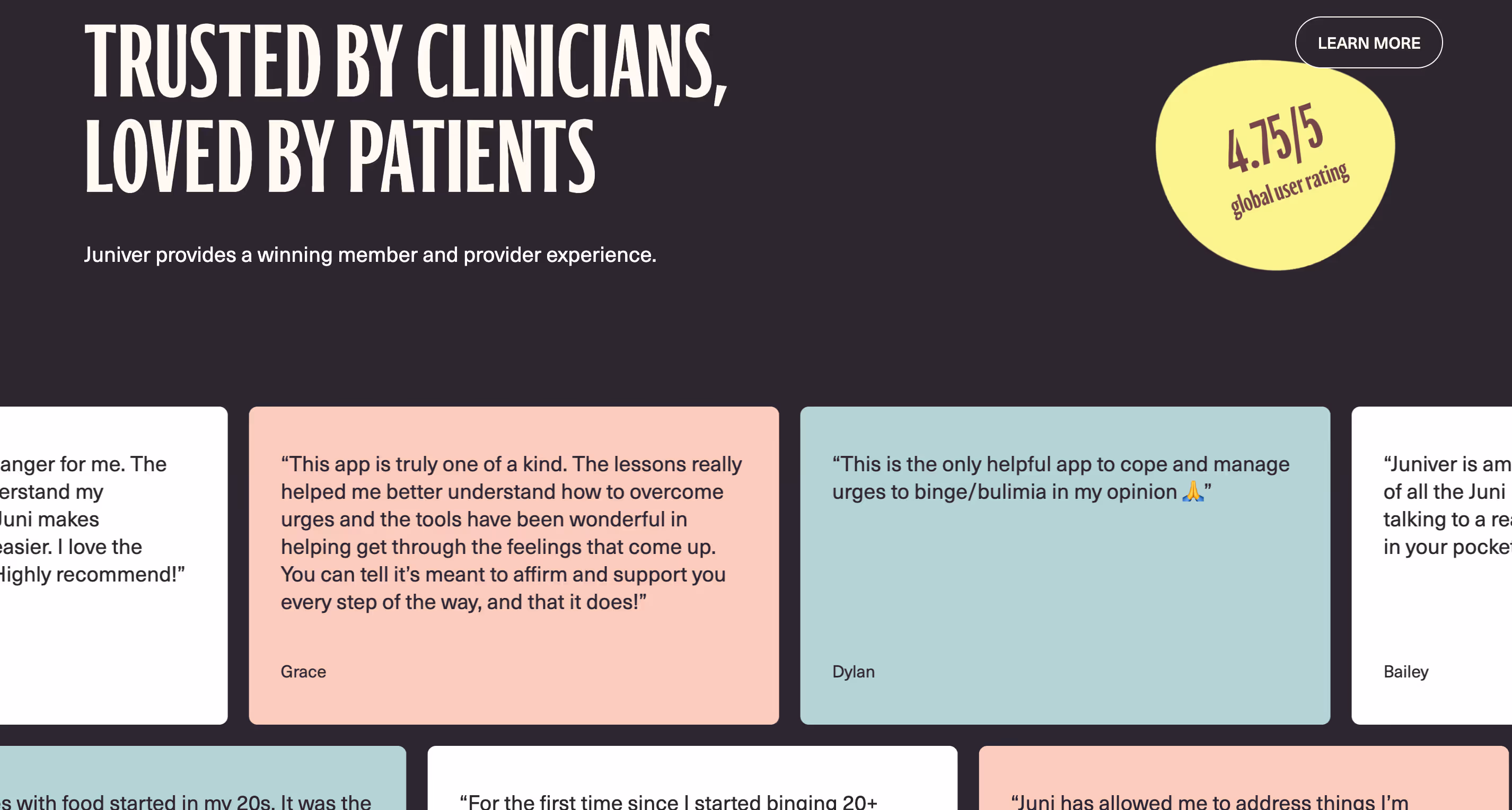
Juniver needed a digital platform that effectively communicated its neuroscience-based recovery program for disordered eating. The challenge was to design an engaging, compassionate, and accessible user experience that would resonate with a diverse audience—many of whom struggle with stigma and anxiety around eating disorders. The site had to simultaneously convey scientific credibility and offer a welcoming, supportive environment. It also needed to clearly showcase Juniver’s unique features such as the AI-powered recovery coach, personalized tools, and community support, while encouraging sign-ups and sustained engagement.
Solution
The design focused on simplicity, empathy, and clarity. A clean, modern layout with soothing colors and approachable typography created a warm, non-intimidating atmosphere. Key content—like the AI coach, micro-interventions, and success metrics—was presented through clear, digestible sections with bold headlines and supportive visuals to enhance comprehension. Interactive elements, such as call-to-action buttons and community invitations, were strategically placed to guide users toward registration. Responsive design ensured seamless experiences across all devices. The design also prioritized accessibility, ensuring users with varying needs could navigate and engage effortlessly.
Outcome
- 68% Improvement in platform navigation and overall ease of use.
- 80% improved user feedback on improved personalized learning paths
- 61% increase in user engagement and platform interaction


-www.joinjuniver.com%20(2).avif)
-www.joinjuniver.com%20(3).avif)
-www.joinjuniver.com%20(1).avif)

-www.joinjuniver.com%20(5).avif)
-www.joinjuniver.com.avif)
-www.joinjuniver.com%20(4).avif)


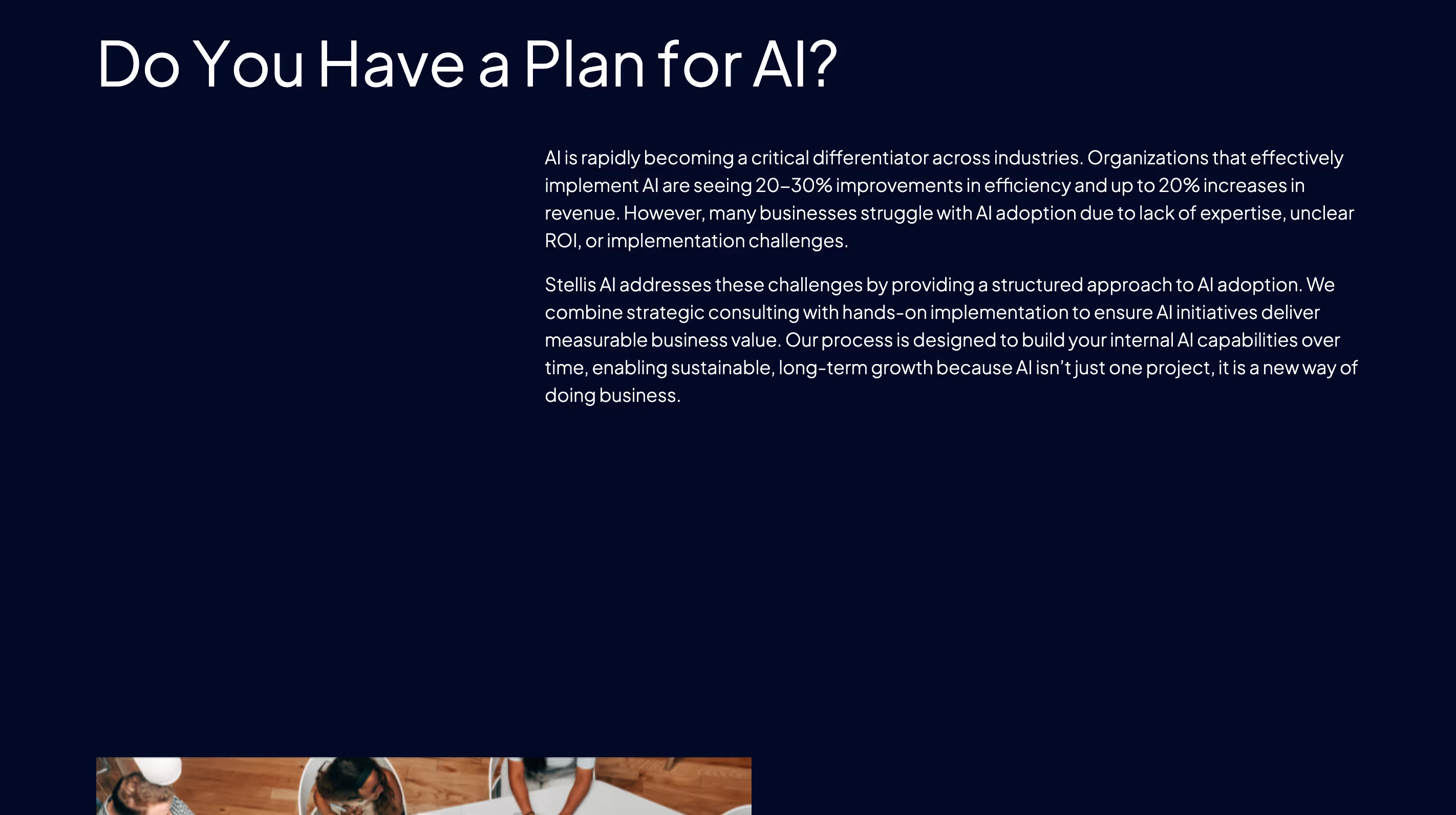
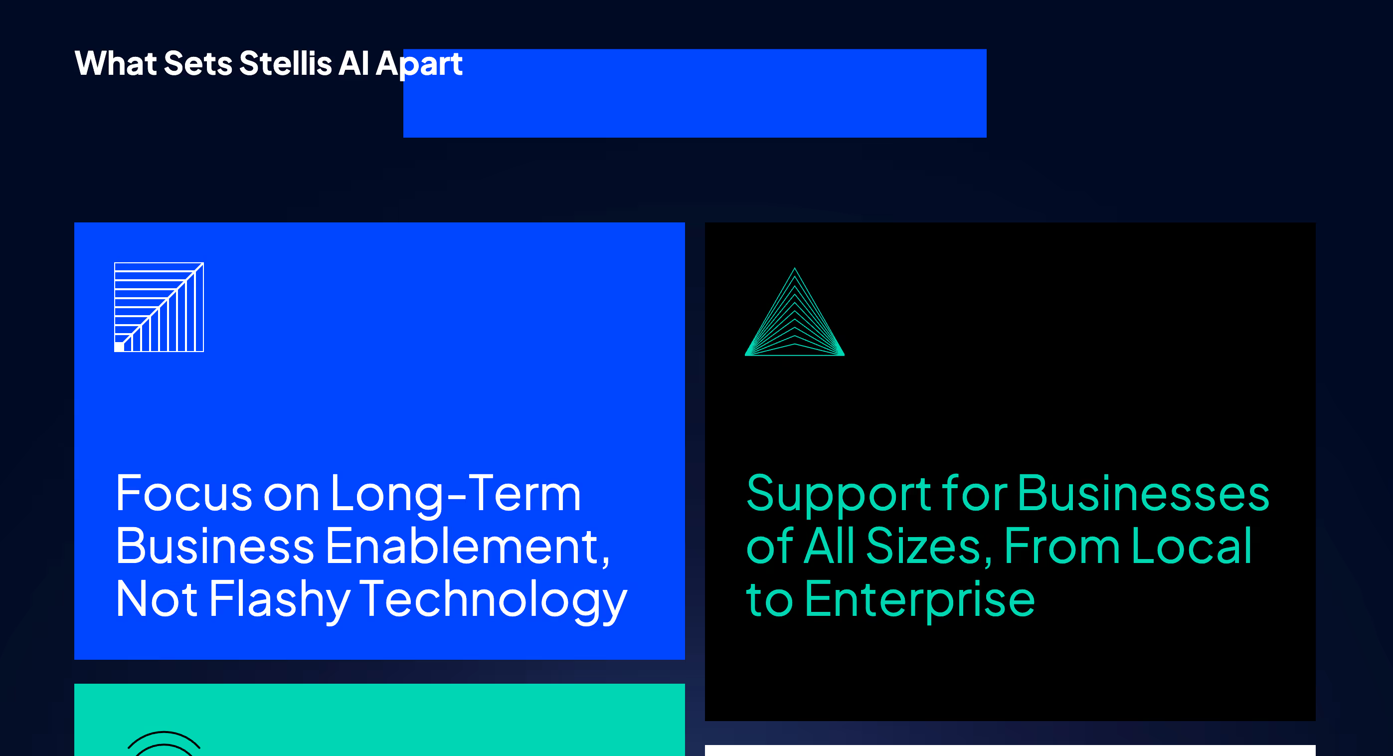
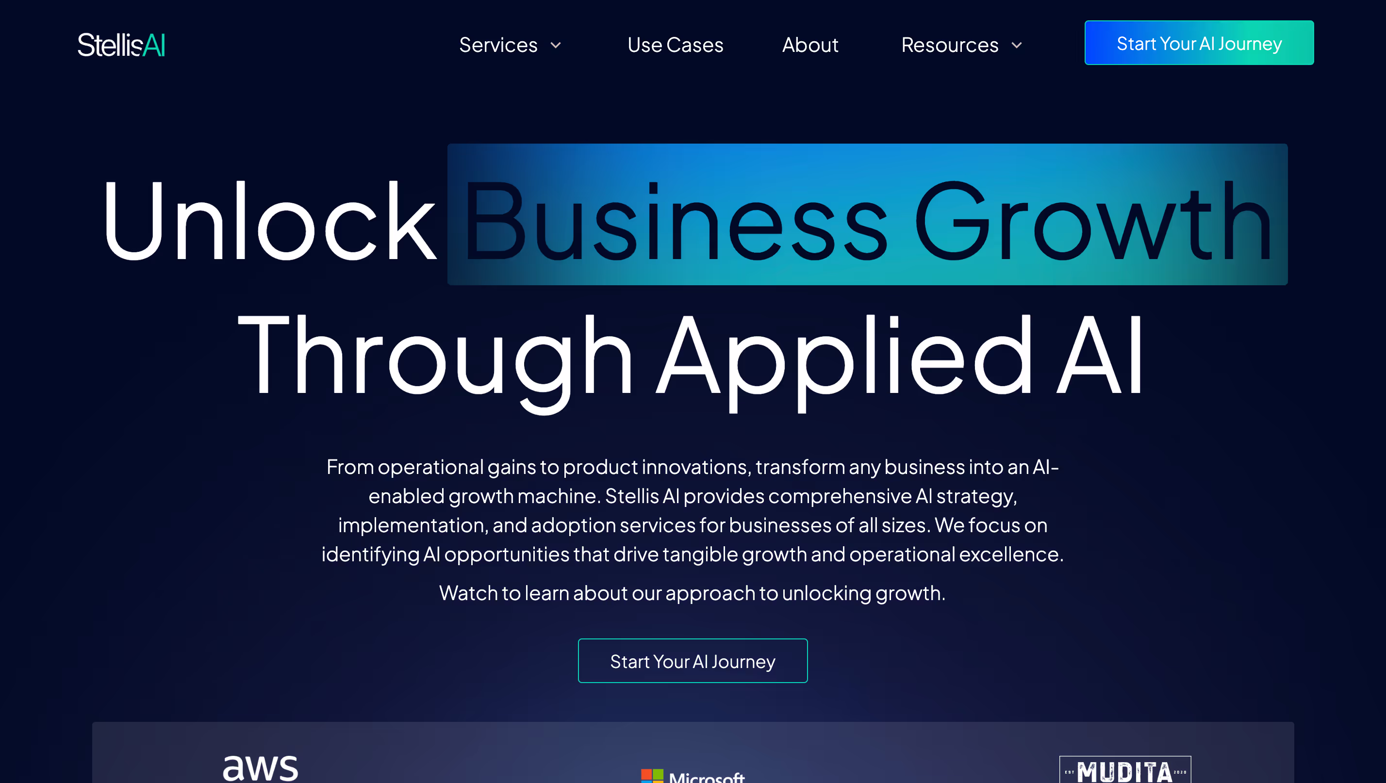
Challenge
Initial website, while visually appealing, needed stronger clarity in communicating its specific AI expertise and the tangible benefits of its services. Potential clients needed more details regarding the types of AI solutions offered, the advisory process for leaders, and the potential impact on their organizations. The website lacked a compelling narrative that would convert interested visitors into booked consultations and beta platform sign-ups.
Solution
Prioritize clarity, engagement, and action. Service Deep-Dives: Created dedicated pages for each core service (Leader Advisory, Custom AI Solutions, Platform Beta) to showcase the specific methodologies and benefits. Expertise showcase highlights the team's AI credentials, industry expertise, and track record of success in building AI-enabled organizations. Case studies and testimonials to demonstrate the measurable impact of Stellis AI's solutions on client growth and innovation. Action-Oriented "Book a Free AI Consultation" CTA's and a streamlined platform beta sign-up process.
Outcome
- 68% Improvement in platform navigation and overall ease of use.
- 80% improved user feedback on improved personalized learning paths
- 61% increase in user engagement and platform interaction


.avif)
.avif)
.avif)


.avif)

.avif)